Email Showdown: SoulCycle Vs. Peloton

At Emma, we’re cheering on any industry sending email, but we have to admit that, especially at the beginning of the year, our eyes are on the fitness industry. While the post-holiday slump sets in and our inboxes get a little quieter, companies like Peloton and SoulCycle are still going full-throttle, and we love getting to be spectators as they go head-to-head in the main event.
From at-home bikes to in-person classes, cycling is trending in the fitness industry right now, and Peloton and SoulCycle compete at the top of their categories. While there are many differences between their products, their marketing goal remains the same—To connect with potential and current customers and welcome them into an effective and inspiring workout experience.
Peloton
The sign-up process
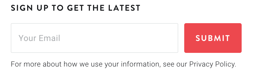
The opt-in form for Peloton’s email list is in the bottom right corner of their webpage. It’s not annoying or flashy, but it gets the job done. It’s clear that their main call-to-action on the website is “Get the Bike,” so it makes sense that an email subscription falls secondary.
They don’t ask for a lot of information, which will limit their ability to send personalized and segmented emails in the future, but this short form provides a user experience that is simple and effortless.
I do think that Peloton’s subscriber count would increase if they specified what “the latest” includes. Will I get discounts? Product news? Insider information? It’s a surprise for now, and I’m excited to find out!
1. The welcome email
Subject line: Bring home the bike for 30 days
Preheader text: Own PELOTON. Bring the Bike home and try it, worry-free.
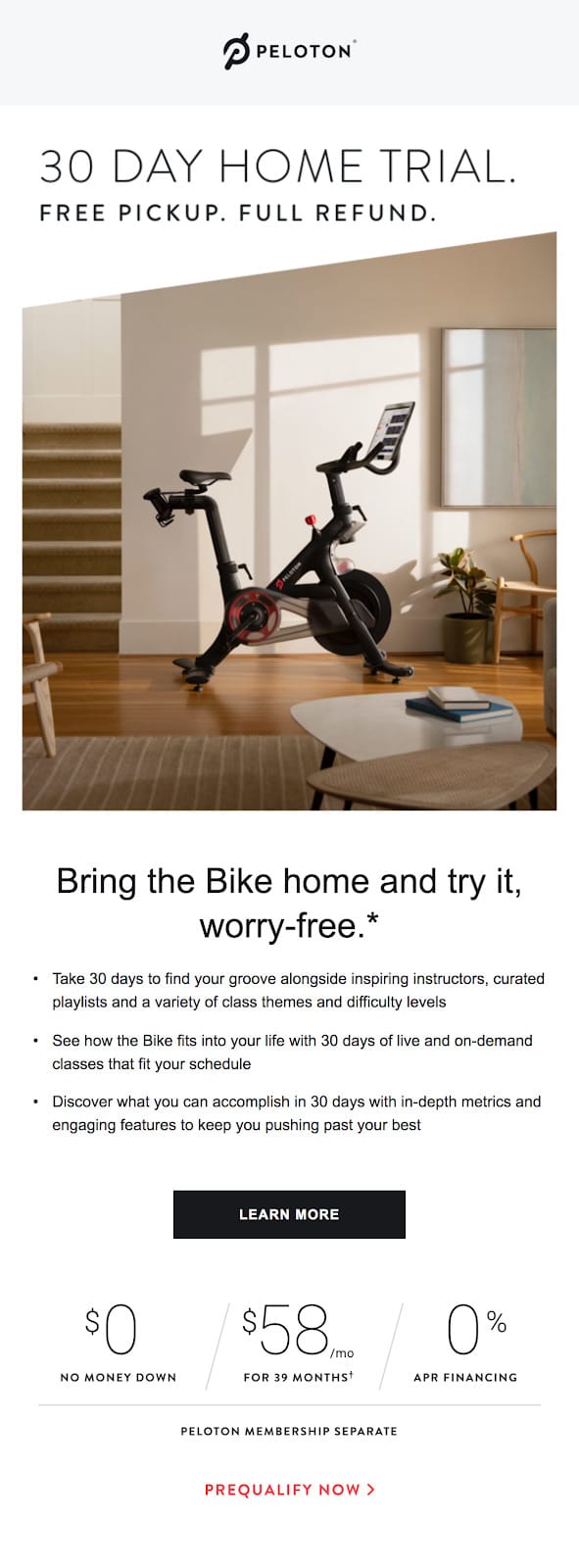
Peloton’s first send is all about the 30-day home trial, and that’s a great incentive for someone who’s on the fence about purchasing their product. Their hero image of the bike emphasizes this message, leading the reader to imagine the Peloton in their own home.
The design of this email is consistent with the clean aesthetic of their website, truly allowing the product to speak for itself.
This first email is clear, concise, and follows a logical reading order. I appreciate that they communicate value without talking about it too much, and the mixture of images, copy, and pricing at the bottom provides versatile support for their main goal.
Overall, Peloton does a great job of removing barriers in this email. Money? Pick-up? Long-term commitment? No problem here.
2. The social proof email
Subject line: My first 30 days with the Peloton Bike, plus why the Peloton Tread is not just another treadmill
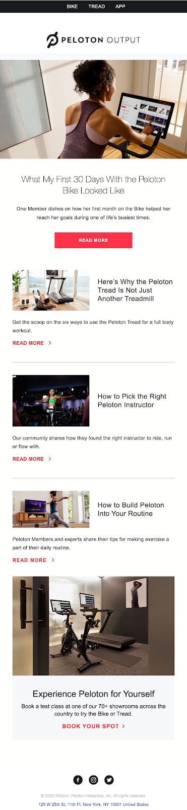
For their second send, Peloton leans into the social proof for their previous claims. While I don’t love this long subject line and lack of preheader text, I love that they’re letting current customers speak to potential new customers right away. Sometimes, the best thing you can do as a marketer is to stop trying to communicate your company’s value and let someone else do the talking.
The layout of this email has a classic element to it that reads like a blog. They provide several article options to the reader, which I really like. The difference in image sizing and abundance of CTAs and white space is a little confusing, but I like the idea behind giving the reader a choice in the content they consume.
3. The additional offer
Subject line: Exclusive Weekend Offer: Free Shoes
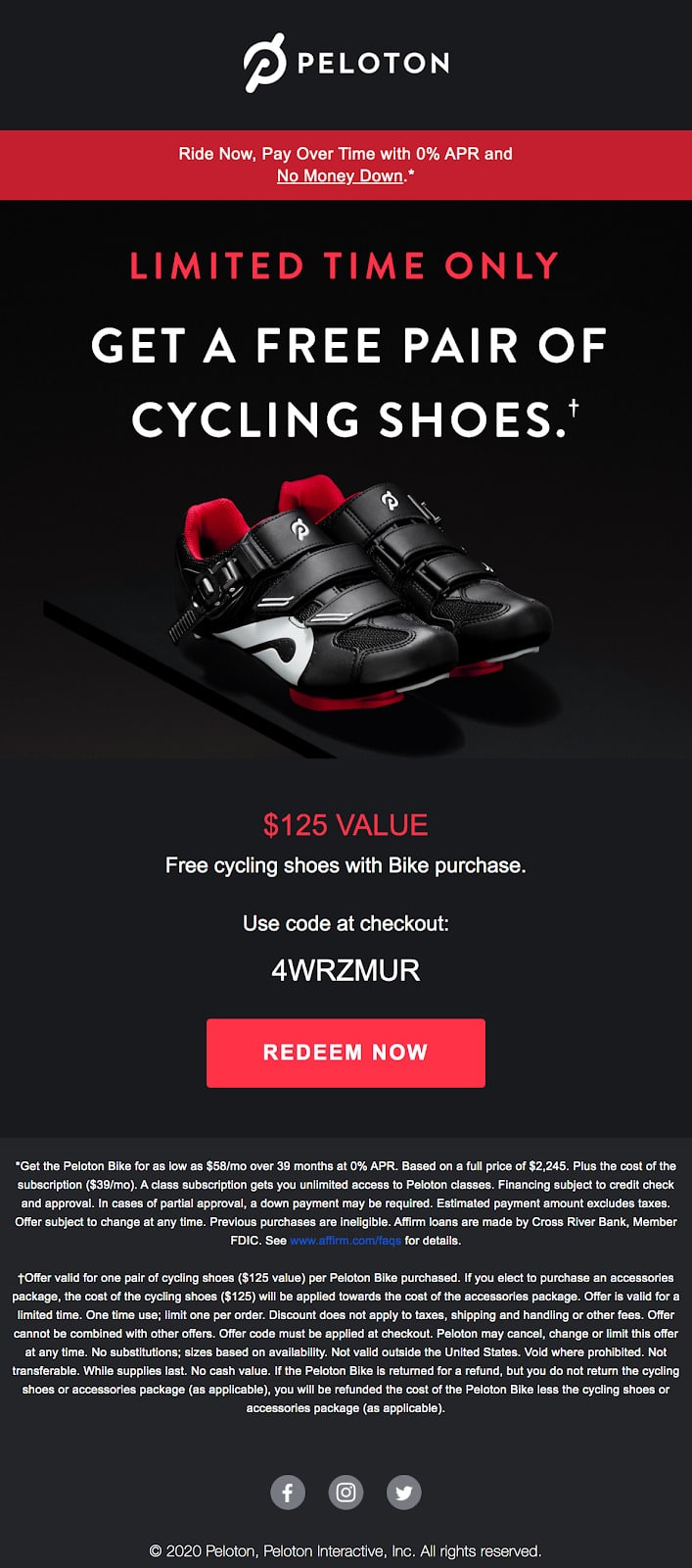
After the first two sends, I didn’t receive anything from Peloton until I went back to the second email and clicked on the link. Behavior tracking is a really great way to determine when your subscribers are close to making a decision and providing them with the content they need to take next steps. However, it’s also important to continue nurturing the subscribers who aren’t quite there yet.
Peloton sweetens the deal with a limited time offer of cycling shoes and a simple email announcement for the discount weekend.
4. The value reminder
Subject line: Ready to Sweat?
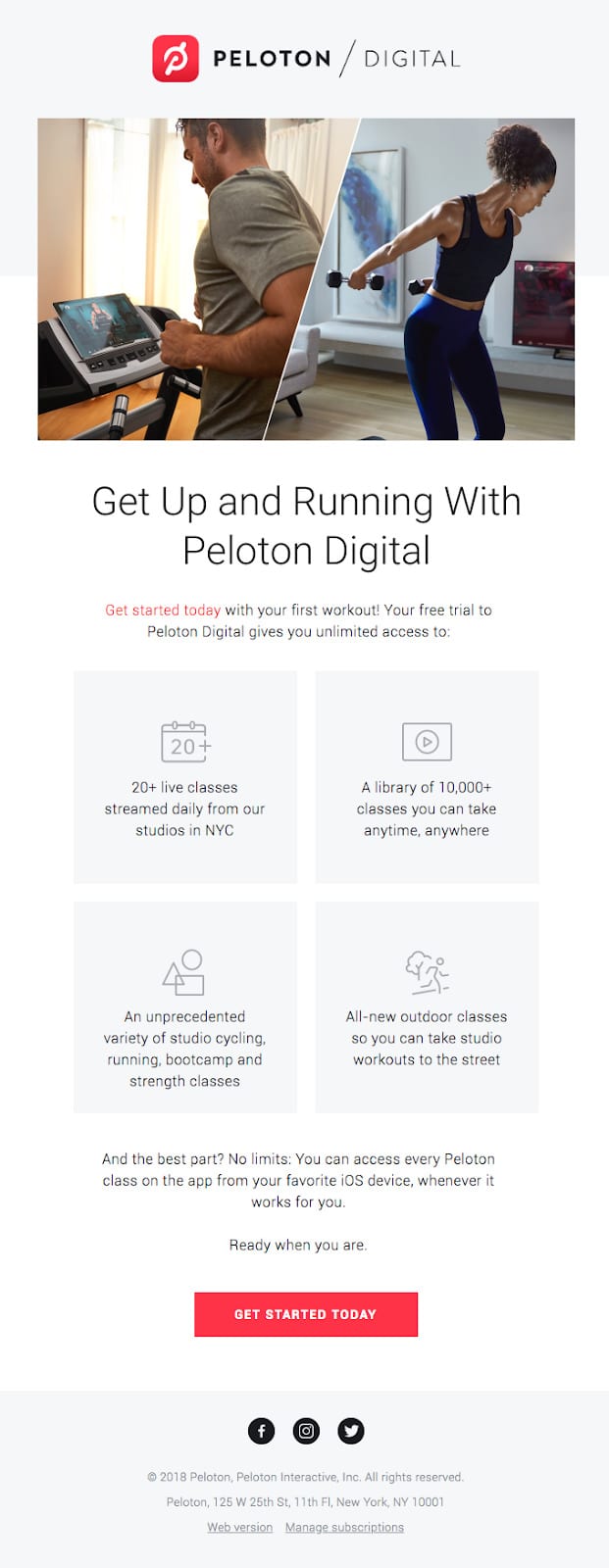
Image Source: Really Good Emails
This email emphasizes the clean and simple design we’ve come to expect and love from Peloton. The grid with icons makes the copy more digestible, and they’re doing a great job of communicating the value not only of the Peloton bike, but also of the digital membership that comes with it.
This is a great example of a nurturing email. You can’t expect your subscribers to understand your product’s value in the first message, but continuing to expand on it over time will help them see it alongside their personal goals. Nice job, Peloton!
5. The ride challenge email
Subject line: Congratulations on joining the PyeongChang Ride Challenge!
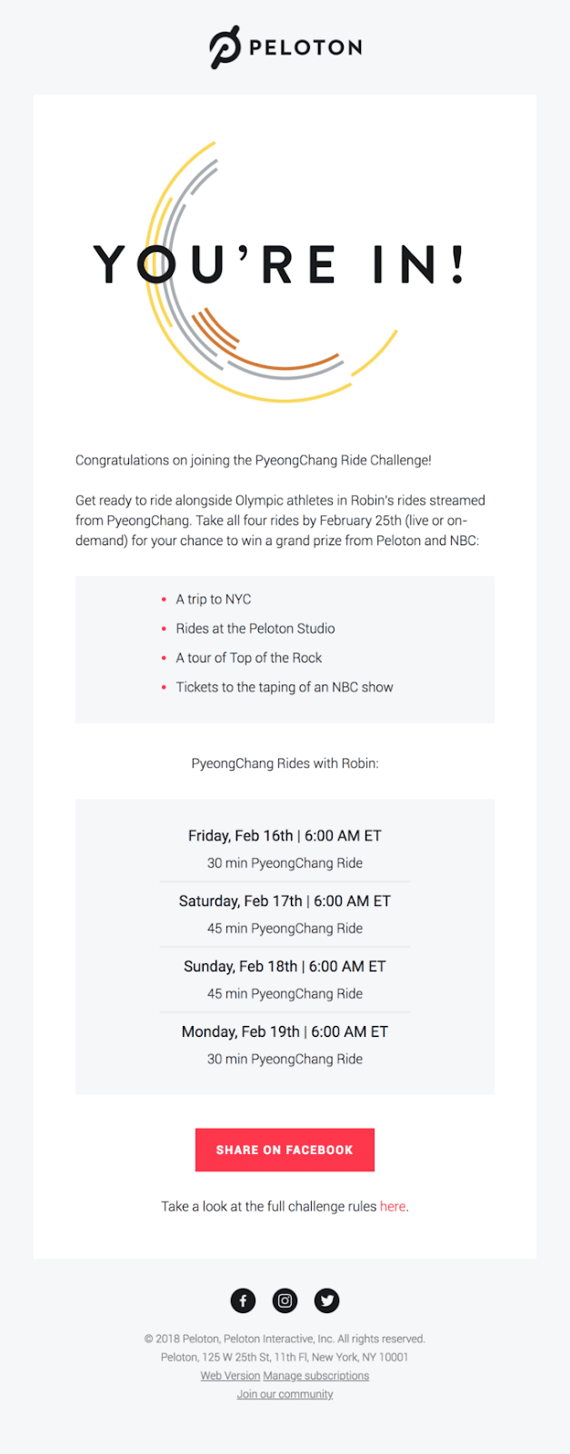
Image Source: Really Good Emails
A fun feature of Peloton bikes is the ability to participate in digital challenges from anywhere in the world. This is the email sent when users sign up for a ride challenge, and it’s great positive reinforcement for registration, as well as encouragement to share on social media.
Now that we’ve heard from Peloton, let’s see what SoulCycle’s been up to.
SoulCycle
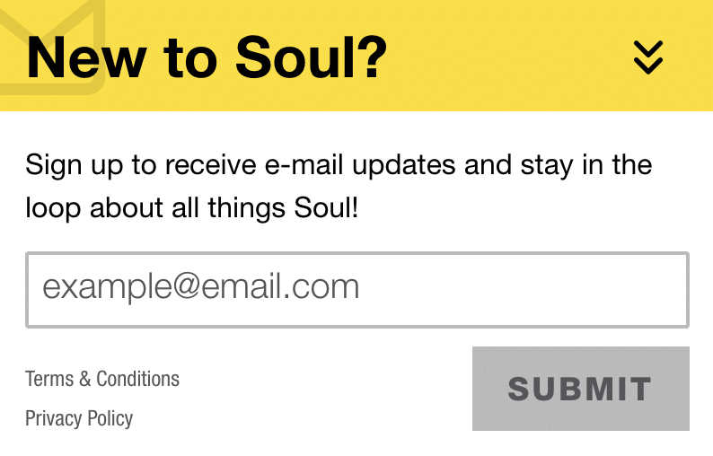
The opt-in
While it was a little bit difficult to find the subscription form for SoulCycle, it’s important to note that, again, there are more important CTAs, like signing up for a first class or creating an online account.
Once I clicked “New to Soul,” I was directed to a page full of information about my local studios, what my first class would be like, and this form to sign up for more information. This was a super easy sign-up form, and while I’m not exactly sure what these “email updates” will include, I’m looking forward to finding out.
1. The welcome email
Subject line: Hey new friend!
Preheader text: Welcome to Soul
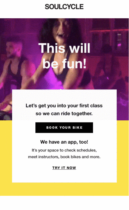
It’s no secret that gifs are our favorite, but this one really sets the tone for your first SoulCycle class. Here, SoulCycle leans into the experience they provide riders—One that is warm, fun, and welcoming. It also shows off the human element of the experience, rather than the bike participants will be riding. This adds a ton of personality to the email, and the bright colors set up subscribers to expect anything but a dull experience from SoulCycle.
2. The product feature email
Subject line: Your new favorite off-the-bike shoe.
Preheader text: Introducing: On Running.
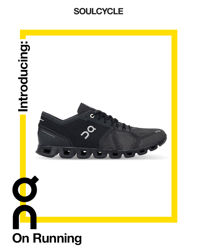
This is a really interesting second send for SoulCycle. While it’s typical for companies to send product features soon after a subscriber joins their list, this one is a little different, emphasizing products that are supplementary (sneakers and workout clothes) to their main value proposition (cycling classes).
While I think it could help build credibility in the fitness space, it could also be a disorienting experience for someone who is still trying to answer the initial questions of, “What is SoulCycle? Who are they as a brand?”
3. The value proposition send
Subject line: Bet you didn’t know this about us…
Preheader text: Consider this our bonding moment.
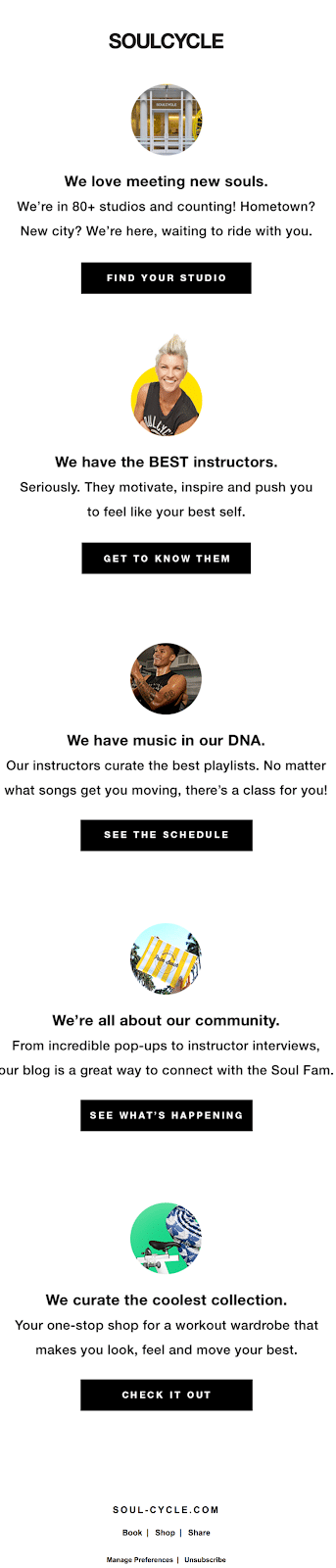
Now this is something I’d expect for a new subscriber introduction. SoulCycle gives their subscribers an opportunity to learn more about their classes, instructors, community, and anything else they may be interested in.
While this admittedly is a lot of calls-to-action at once, I do like that they are giving readers the option to explore on their own and find out more about different aspects of the company.
4. The confirmation email
Subject line: You’re in!
Preheader text: Good news: you’ve booked a bike!
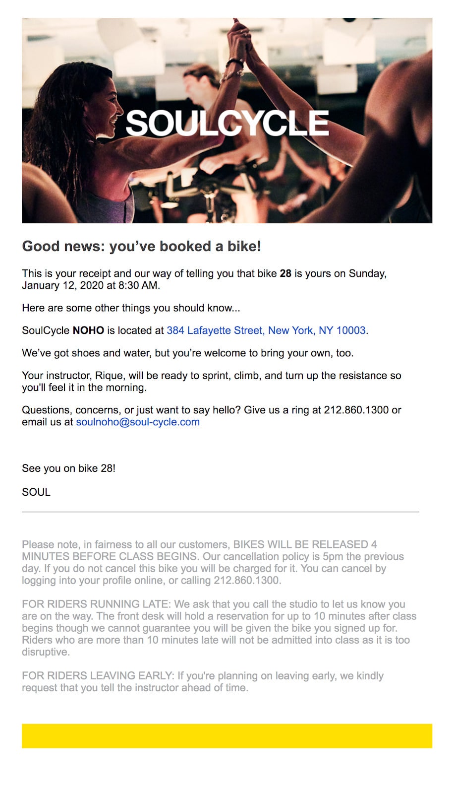
My coworker took a SoulCycle class in New York City, and this is the confirmation email they sent when she booked a bike. It’s clear, to-the-point, and gives her all of the necessary information for her first class. I love all of the specific details about what she should bring, who her instructor is, and a reminder of where the studio is. (This will be helpful if she’s like me and is scrounging to put the address in her GPS with no time to spare!)
The imagery is still consistent with their brand and communicates their community-forward approach. Bravo, SoulCycle!
5. First class introduction email
Subject line: Read this before your first class!
Preheader text: Can’t wait to meet you.
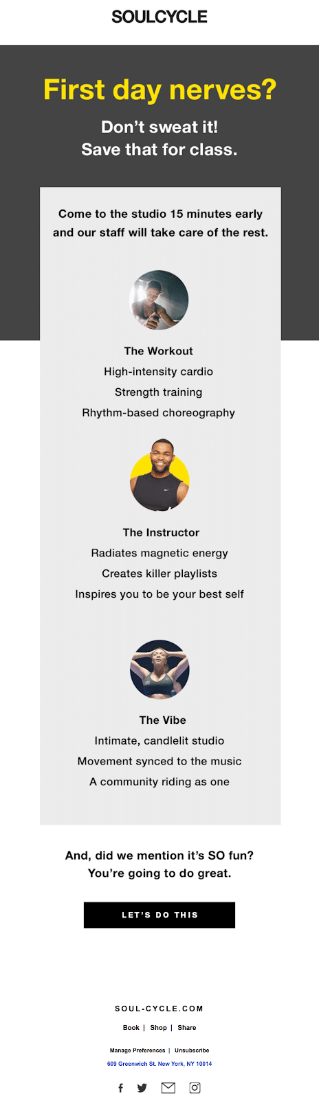
I really love this send because it takes into consideration the hesitation and nerves my coworker may have before her first class, and helps show her what to expect next.
It’s important to think about your customer’s journey when you create emails, considering the questions they are asking themselves, anything that may be holding them back, or additional information they may find helpful.
The verdict?
This is a really tough one! I should also note again that these emails are both in a league of their own, and I’m sure they’re both consistently building relationships with their customers. I love the simplistic design of Peloton’s approach, and the amount of online resources they provide to their subscribers.
On the other hand, SoulCycle’s caring approach to making sure new riders have everything they need before their first experience is a great example of understanding the customer journey. Combined with email designs that really capture the energetic experience of a SoulCycle ride, I think they take the lead here.
WINNER: SOULCYCLE
About the Author
Kaitlin Wernet is a content specialist on Emma's marketing team. When she's not restraining herself from using too many exclamation points or grabbing one more La Croix from the office kitchen, she can be found working on her first book or planning her next big travel adventure.
More Content by Kaitlin Wernet
MOST RECENT ARTICLES


Want to engage your audience and grow your brand? Try Emma's robust easy-to-use product today.