The ultimate guide for effective email design

What is the most important aspect of a marketing email?
If you said content, you’d be on the right track. If you said design, you’d also be on the right track! The truth of the matter is that both of these components are vital to the success of your email marketing campaign. Neglect one and it won’t matter if the other is spectacular or not.
To ensure your marketing efforts are effective, you need to find ways to ensure that your email design and content are equally amazing.
Today, we’re going to focus specifically on email design. We’ll look at design best practices, what to avoid, some brands that are getting it right, and we’ll follow that up with a final checklist that you can utilize each time you write, design, and launch a marketing email.
Why your email design matters so much
They say that content is king. If that’s the case, does email design really matter that much?
Actually, it does. The design of your emails can have a huge bearing on your conversion rates. When you send your content out to your audience, you want to make sure that they are:
- Noticed
- Opened
- Read
- Acted upon
All of that requires attention-grabbing design. You can think of your design as your foot in the door. You can’t make a great impression on someone if they’re not even paying attention to you. Your design is what will do this for you.
The ultimate email design checklist for creating amazingly effective emails
Here’s your ultimate checklist for producing an incredibly designed email. Below, you’ll learn about:
- Email design best practices
- Some things to avoid
- A handful of brands that are killing it with design.
Email marketing design best practices
What comes to mind when you think of email design? Many people think about the images they’ll use, the colors they’ll incorporate, and whether they’ll use a single-column design or multiple columns.
Your design goes farther than this, though—at least, it needs to in order to turn into an email that converts.
These are a few things to consider when drafting the design of your email.
- Brand optimization: Everything about your email should point to your brand. Yes, this includes the colors and overall design, but you need to include more than that. The “from” field in your email should contain your business name, your mailing address should be easily located, and the “to” field should contain the name of your recipient, not just their email address.
- Email layout: The design of your email should be easy on the eyes and optimized for mobile devices. Your best bet is to use a vertical, single column design as this is seen easily on any device. Limit the number of sections contained in your email, as emails that are too long don’t always convert as well as shorter ones. The width of your email should be between 500-650 pixels.
- Call to action: A clear call to action is a must for every email. Without it, your recipients might just think you want them to read the email and that’s it. If you want emails that convert, you need to show your subscribers what you want them to do once they’ve finished reading the contents of your email.
- Add a footer: The end portion of your email—the footer—contains pertinent information for your subscribers. It contains your contact information, as well as link buttons to your website and sales pages. It should also contain a section entitled “why you’re receiving this email” to let them know that the reason your email is in their inbox is that they subscribed to it.
What every checklist should have: What not to do
Email marketing is different from other types of marketing for a number of reasons. One of them is that when you get it wrong with email design, it can have a major impact on your campaign.
Typical “fails” in other marketing endeavors (broken links in blog posts, typos on social media, etc.) can be found and fixed. When you make a mistake with an email, though, there’s no going back.
Use the time before you send out your marketing emails to avoid the following email design fails.
- Not optimizing for multiple screens: This was mentioned above, but it bears repeating. If you don’t take the time to make sure your email can be seen by someone on a desktop computer, laptop, tablet, and/or smartphone, you’re missing out on a golden opportunity. People will be annoyed at poor email design and this can increase un-open or unsubscribe rates.
- Personalizing your emails: It’s 2019. There’s no reason that someone on your subscriber list receives an email addressed to: Dear [email address]. Opt-in forms always ask for at least the person’s first name, if not their first and last. Failing to personalize makes you look like a spammer.
- Low-quality stock images: Many people need to use some sort of stock images for their content. Maybe they don’t have the time, talent, or resources to take their own photos. That’s fine—as long as they’re top quality images. Poor images that have been used hundreds of times before will make you stand out for all the wrong reasons.
- Keeping blue links: You want links in your email content, especially for your call to action. Unfortunately, some email links can be easily lost amongst your background colors. Lost information means fewer click-through rates, and ultimately, fewer conversion rates.
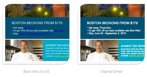
Source: Litmus
Brands that are getting it right: Examples of awesome email designs
There are numerous brands out there that are doing some great things with the design of their email newsletters. Here are just a few that have stood out to us recently. Follow their lead and you, too, can create an email that will spark some interest.
Living with Homestyle: Attracting attention with color
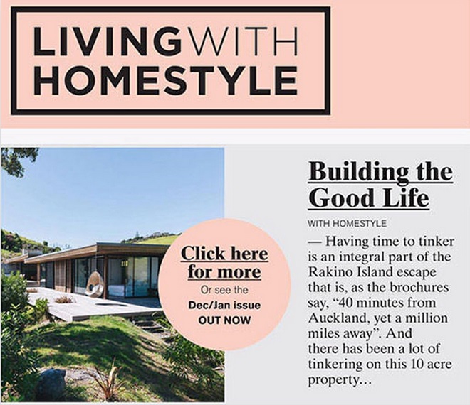
Source: Campaign Monitor
Why we love their design: Color is your ally when it comes to email design. You can use it to grab attention, draw the eye, and contrast various parts of your email content.
You can go crazy with color, using bright shades to grab attention fast.
Or, you can use color in a more subtle way, as is shown in the example above.
In this email, the marketers have kept things simple, utilizing two main colors: gray and pink. The two colors complement each other. However, the pink is bright enough to stand out against the gray, drawing the eye to what’s important about the email: the call to action.
Interface Lovers: Putting a spotlight on your content
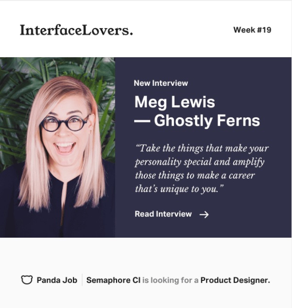
Source: Really Good Emails
Why we love their design: What if you’re not selling a physical product, but rather, a virtual product or service? If that’s the case, you need to let your content shine.
This is what Interface Lovers has done. Interface Lovers is an online magazine for creative people who want to put their creative talents to work. They provide interviews with other creatives who’ve been able to turn their passions into something they do for a living.
The interviews are at the core of what Interface Lovers provides. Therefore, they keep their email design simple, using a professional image of the person they’re interviewing, along with a quote encouraging subscribers to read the entire interview.
Another thing we love: Their call to action is really clear. The reader knows exactly what they need to do.
Fairline Boats: Cohesive message displayed in both the text and images

Source: Campaign Monitor
Why we love their design: Making sure your text compliments your image(s).
In this instance, you see an image of a high-class boat in some remote, exotic location. That tells the email recipient that this is a high-quality boat built for people who want—and can afford—to travel the world.
The text above the image underscores that message. It makes it loud and clear: We’re selling world-class boats built by a world-renowned boat builder. It’s not just a pretty picture—it’s proof that you’ll get exactly what you’re willing to pay for.
Your go-to checklist for email designs
Before you send your emails out, do one last quality assessment. Compare your email against this checklist for best results.
- Spelling/grammar
- Clear, concise subject line
- Clear call to action
- Optimized for mobile devices
- Your name in the “from” field
- Your subscribers’ name in the “to” field
- No blue hyperlinks
- High-quality images, optimized for mobile
- Content is engaging and not too long
- Email colors are attention-grabbing without being a turn-off.
Wrap up
While the content of your email is always important, not to be forgotten is your overall email design. You want to make sure the design reflects well on your brand, showing email recipients that you care about quality and about their wants, needs, and interests.
When designing your email, you should:
- Use color to your advantage
- Make it clear who is sending the email
- Personalize the email as much as possible
- Have a clear call to action
- Avoid some common email design fails.
Use this list to design an email that will not only improve your open and click-through rates but also your conversion rates.
Still feeling stuck on your email design? See how Emma can help.
About the Author
Emma is an email marketing platform that gives you all the tools you need to send campaigns that really connect with your subscribers. With our
More Content by Emma Email
MOST RECENT ARTICLES


Want to engage your audience and grow your brand? Try Emma's robust easy-to-use product today.