The top 5 most critical landing page do’s and don’ts

Your website is essentially your business or organization’s digital hub. It’s a central point of focus that most of your ads, social media posts, emails, and other marketing materials will all lead back to.
As a digital marketer, you already know the importance of landing pages on your site. Many of your conversion goals likely revolve around driving people there. You’ve probably linked to them countless times, and your digital marketing goals likely almost always revolve around promoting them either directly or indirectly.
But how do you create great, effective landing pages? How do you keep them fresh and engaging? In this post, we’ll cover some landing page best practices and tips to help you produce fantastic results. We’ll provide five tips about how to create a great landing page and five common habits you’ll want to avoid, along with some landing page examples to get inspired.
5 Things you should do to create a great landing page
The landing page is often a customer’s first impression of you online. If not their first exposure to your business or organization in general, it’s almost always their first view on your website.
1. Open up with the benefits.
When it comes to digital marketing, first impressions are everything—they’re even more important that marketing in real life. The customer may take careful note of your landing page’s design, artistic appeal, content, and layout. All of the pieces that make up your page are important, however your viewer is likely most concerned about one thing above all: themselves—they want to know how you can help them and how what you have to say (or offer) matters to them.
This landing page from popular internet content marketing tool, Moz is one of our favorites that focuses on benefits.
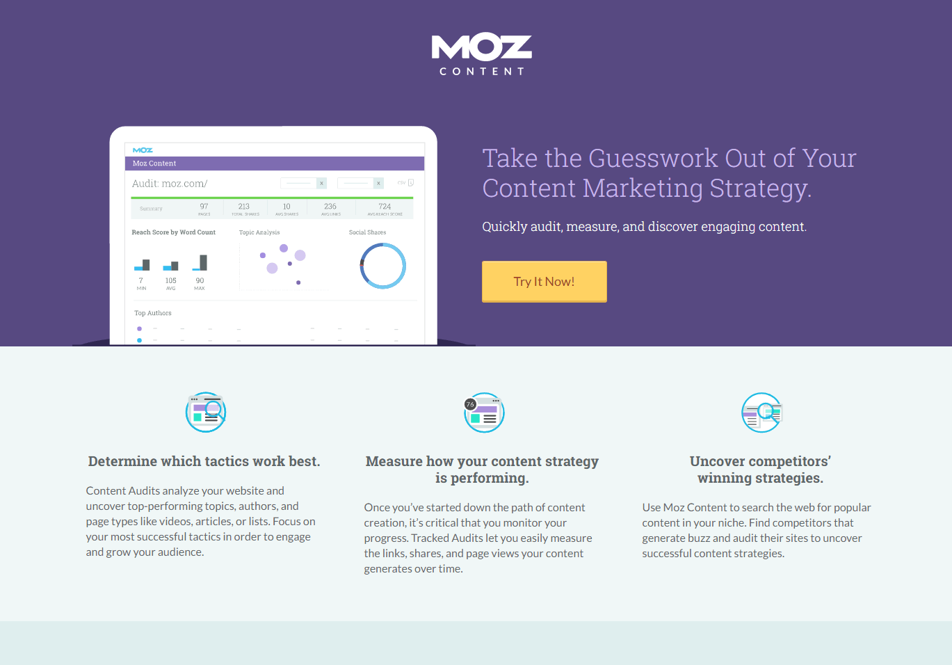
Source: Moz
Drawing the difference between features and benefits is something most marketers are aware of, though this doesn’t always translate to a landing page. Yes, it’s important to list some features of your company and/or product. However, you should always focus on your value proposition first and foremost.
2. Use expert copywriting and lose the fluff.
You might be saying “duh” at first, but the second part is worth reinforcing for the purpose of this list. If you look at great landing page examples, they all have great copywriting. Common themes among them are: powerful words, active voice, and most importantly, concise direction. And as always, make sure you have a good SEO strategy intertwined with your copy.
Your copywriting should say the most with the least. Use fewer words to get the point across when possible, and get to the point quicker. The point, in this case, is either the aforementioned focus on benefits or the call-to-action your bringing to the reader.
3. Choose layouts that make for easy reading.
We know from research that people don’t respond to overwhelming text blocks or flashy graphics that look straight out of the early 2000s. Users respond well to a balanced presentation that combines images, text sections, and forms. The balance “breaks up” content so it becomes easier to digest, both visually and mentally.
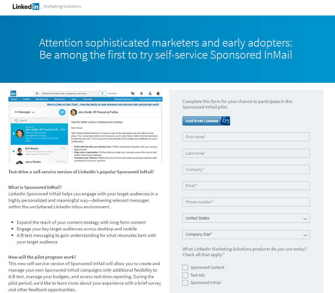
Source: LinkedIn
Check out how this page opens up with a simple headline in a clean image banner. It then transitions to a screenshot, a couple of paragraphs (with benefits laid out in easy-to-follow bullet points) and a contact form. It looks neat, tidy, and most of all, very inviting to the reader. It’s also very skimmable, which is important with our short attention spans.
4. Be specific in your offer, vague in your ask.
This is a double tip. When you’re talking about your company or organization, be it the features you provide or the benefits that come along with them, be specific. Don’t just tell your audience that your tool will help improve their marketing success, tell them how. Does it provide audience insights? Tracking data? Be specific, and as we’ve mentioned previously, always be accurate to encourage legitimate conversions.
When it comes to what you ask, do the opposite. Be as generic as possible, or perhaps more accurately, ask for as little as possible. People don’t like to be overwhelmed with questions, so go easy with what you inquire of viewers. Asks, or calls to action, that are enticing and encourage curiosity tend to be the most effective.
5. Always consider (and prepare for) objections.
The message you try to put forth will be considered by your reader. While consideration can lead to acceptance, it can also lead to objections. It’s best to prepare for these ahead of time so you can answer any concerns your reader may have.
These concerns could be addressed by providing links to a FAQ section covering most common inquiries, or even a link to chat support so a person can get their questions answered as soon as they come up. Great landing pages are often informed by research into buyer personas of the audience, and objections that can arise to those personas.
5 Things you should avoid doing with your landing page
For all the good advice out there about how to make a great landing page, it’s also worth noting what not to do. Sometimes, producing great tactics is just as much about avoiding common mistakes as it is about sticking to best practices.
1. Optimize for desktop only.
It’s estimated that more than 60 percent of internet users access the web via their mobile device. That’s a massive chunk of traffic you could be missing out on if you optimize your site solely for desktop. Many site builders allow you to optimize for both, but some people pass on this or don’t have the capabilities to do both.
While it may be viewable on mobile, if not correctly optimized, the page can appear to be out of proportion, some of the clickable buttons may not work properly, and you risk having some images or text being cut off. Additionally, rendering errors are also common, as well as accessibility issues. If users can’t find their way around and navigate the site on their phone, they’re likely to simply move on. Resist the urge to focus solely on your desktop audience, or risk turning away a lot of your audience.
2. Crowding the footer.
Digital marketing is about linking your platforms together and getting the most out of each. However, sometimes it’s possible to go overboard and overwhelm the reader. The footer is the most common area that tends to be busier than it needs to be. Many site builders allow you to put a lot down there, from supplementary text to social icons.
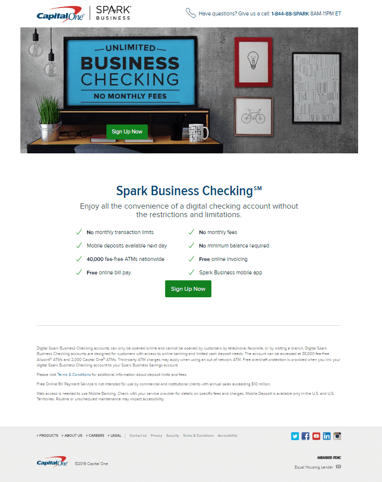
Source: Capital One
This isn’t a bad landing page by any means. It has a lot going for it, but the lower half seems quite jumbled and busy. Even though companies in this industry are mandated to include a lot of information about terms, that could potentially be added in a link set to open in a new window. Combine the chunks of tiny text with multiple social icons, and the bottom becomes a bit distracting.
3. Unbalanced text or images.
Sometimes, you may not see a need to include text and images on a page. There are some cases where you can say what you want to say with simple sentences and paragraphs. In others, you can accomplish the purpose of the page with one or more graphics. Should you bother with balance if you don’t see an immediate need for one?
Many people make the mistake of passing on this or simply forgetting about it. They end up with a page that either looks like a research paper or an art project. When the balance is skewed in one direction or the other, the page can either look underwhelming or overwhelming. Either way, it distracts from the message and isn’t terrible for conversions.
4. Using uneven designs.
Admittedly, there is some subjectivity that comes into play when it comes to the artistic appeal of a landing page. Good landing page examples, however, have color choices that make the page look balanced, even if some parts jump out at you more than others, and aesthetically pleasing. Take a look at this one from Airbnb.
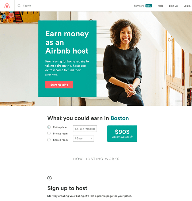
Source: Airbnb
The top portion looks great. The image is upbeat and inviting, with the message made more readable thanks to a colored background. Even the CTA button jumps out. But when you look down, the white background creates an awkward, unbalanced vibe. The page looks too top heavy, and therefore it makes the viewing experience a little less enjoyable than it could be. A colored background could’ve worked really well here, or a reorganization of the overall page’s contents.
5. Avoid confusing language.
We mentioned being concise in the do’s section, and sometimes this can lead people into a trap. If you’ve been working in an industry for years, you know how to describe things by their names and using insider terms. But think to yourself, how many readers will know that word without having to look it up?
Keep your language as simple as possible. You want it to be concise and accurate, but you don’t want the reader to have to keep a second tab open so they can look up what you’re talking about. If they have to do that, they’ll likely just find another site (abandoning you altogether) rather than go through the trouble.
Improve your landing pages for better user engagement.
Landing pages come in many forms, and they allow you to be flexible in your design strategies. Follow these do’s and don’ts, and you’ll be on to boosting conversions and engagement in no time.
Need more examples? Check out these landing pages that convert.
About the Author
Emma is an email marketing platform that gives you all the tools you need to send campaigns that really connect with your subscribers. With our
More Content by Emma Email
MOST RECENT ARTICLES


Want to engage your audience and grow your brand? Try Emma's robust easy-to-use product today.