How to write effective welcome emails in higher education

Marketing in higher education can be tricky.
Prospective students, new students, alumni—each group has unique needs and spans multiple demographics.
These challenges make email the perfect tool for unifying your higher education marketing.
Email marketing thrives when you can effectively segment your list based on unique demographics. With higher ed, those segments are predetermined when people sign up for certain lists and provide personal information. This way, personalization comes naturally (if you have the right tools).
Nailing your welcome email for higher education is critical. You want to make a warm and welcoming impression while guiding students through stressful processes.
Try these tips to make the most of it.
Why is a welcome email for higher education so important?
People of all ages and demographics use email. Over 90% of people under 65 own at least one email address. An email address is necessary for opening a Facebook profile, conducting school applications, and doing almost anything online.
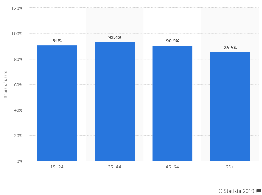
Source: Statista
But what’s so special about welcome emails for higher education?
For starters, welcome emails have an average open rate of 50%. That’s 86% better than standard newsletters. In higher education, where a student is looking for answers and the next step to take, the open rate is even higher.
For students, higher education can be stressful, frustrating, and confusing. 63% of students in the U.S. report that they experience anxiety. Subscribers need to feel like your institution can provide help and guidance.
Plus, higher education is a huge investment for students—in both time and money. Faced with such a massive decision, prospective students are signing up for several college email lists at the same time.
Show them your institution can provide the most seamless and straightforward experience. One way to achieve that is through your welcome email.
Different email lists deserve different welcome emails
Lead magnets, landing pages, targeted social media ads—these all provide vital information about why a subscriber signed up to your list.
Use that information (along with any data already in your system) to dictate which type of welcome email they receive. Subscribers can fall into any of the following categories:
-
Prospective students
-
New students
-
Alumni
-
Athletics and activities
-
Waitlisted students
Decide on a specific goal for each welcome email to dictate your content.
For example, prospective students aren’t always ready to apply. Share alumni testimonials, campus tour videos, or course catalogs in their welcome email—things that could convince them your school is the right choice.
New students, however, are probably feeling overwhelmed. Don’t add to that. Use their welcome email to gently introduce them to the school one step at a time.
Don’t neglect your subject line and preview text
About half of Generation Z spends at least 10 hours on multiple devices each day—like smartphones, TVs, and laptops. Meanwhile, 51% of them use ad blockers. So they have no patience for disingenuous emails.
Subject lines should be short so they don’t get cut off in push notifications. Between 30 and 35 characters is ideal.
For welcome emails for higher education, use caution when creating a sense of urgency. Encourage action but don’t overwhelm your subscribers.
Instead, try an assertive, actionable, and friendly tone. Something like “Welcome to OU, take a digital campus tour” works much better than “Welcome to OU, register now before it’s too late.”
Preview text is also important because subscribers will get a peek in their push notifications. Use preview text to elaborate on the email’s contents without repeating your subject line.
Stick with a single call-to-action (CTA) in your welcome email
Each welcome email should have a goal. Are you introducing prospective students to university life? Guiding new students through the process?
No matter your goal, use a single CTA.
When people are presented with too many choices, they often get overwhelmed or confused and do nothing. Help make the process easier with your welcome email.
Instead of giving them a link for everything (tour, financial aid, orientation, sports, campus life), give them one single task to complete.
It’s also a smart idea to use a CTA button—rather than a hyperlink—in a bright contrasting color.
Check out this alumni email from the University of Pennsylvania. It gives subscribers three clear and direct CTAs along with a button that just begs to be clicked.
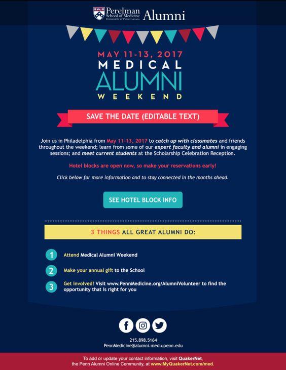
Source: Pinterest
Include a preference center link in your welcome email
When someone signs up for your email list, you’ll want to learn certain things about them:
-
What program or degree program are they interested in?
-
Do they care about sports or campus activities?
-
Do they plan to attend classes on campus or online?
-
Will they need help with financial aid?
-
How soon do they want to start classes?
A preference center asks these questions so you can send the most relevant content possible. You can also ask subscribers how often they want you to contact them. Some may only want important stuff (like job postings) while others may want newsletters.
Here’s an example of a preference center from Coursera.
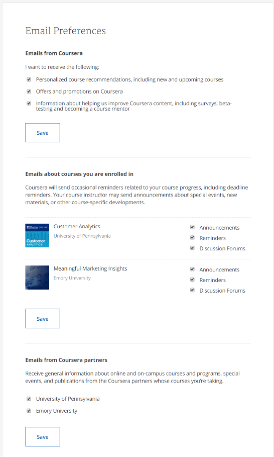
Source: Coursera
Give special effort to voice and branding in your welcome email
Now’s the time to show off your colors. Go big with your branding and logos in your welcome email.
While most universities have detailed branding guidelines for other marketing material, they often fall short with email.
Familiarity and consistency are critical for building trust. Make sure you only use your school’s colors when designing email layouts. Include your school’s logo in the email header and on any relevant photos.
University of Alabama uses their logo and name up front and relies on blue and gold throughout the email.

Source: Pinterest
Keep copy tight in your welcome email for higher education
In certain cases, like letters from the dean, you might be able to get away with longer emails.
But in general, keep copy concise and leave plenty of white space.
Make your point quickly and give subscribers the tools they need to complete an action. If they open an email and see huge blocks of text, they might get scared away.
In this newsletter, the University of Maryland makes good use of white space by including a few lines of copy for each section.
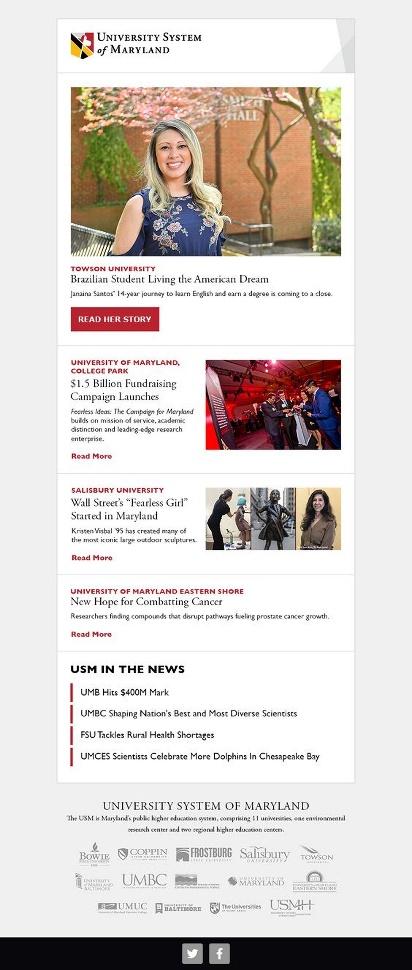
Source: Pinterest
Let images and multimedia do the talking in your welcome email
Instead of writing a novel, choose stunning images for your welcome email.
Choose visuals wisely. The design experts at Nielsen-Norman say your images should serve a distinct purpose and relate to your copy directly. If images are too ambiguous or simply fill space, your subscribers will notice.
Photos of real people tend to perform well. Plus, research says that 67% of Generation Z responds best to advertisements with real people.
Northwood University used big images of students on campus for this event invite email. Plus, they included plenty of branding.
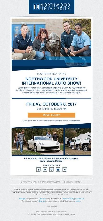
Source: Pinterest
Use mobile-friendly layouts and landing pages
Over half of all emails are opened on mobile devices. Remember that your younger subscribers will probably open your emails on multiple screens—for example, they might first read your email on a mobile device and then later on a laptop.
If an email doesn’t look right on mobile, over 70% of people will delete it in under three seconds. Now, if it’s a welcome email from a school with information a subscriber really needs, they may not delete the email but it’s likely they’ll get frustrated.
Start your conversation with new subscribers on a positive note with mobile-friendly or mobile responsive designs. Responsive designs change their layout based on the device a subscriber uses.
At Emma, we offer dynamic emails that are hyper-personalized for each recipient.
Zaytuna College used a nice layout that looks great on both mobile and desktop. The email has a single column design which is easier for mobile recipients to read. Plus, it relies on imagery and white space over big blocks of text.
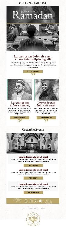
Source: Pinterest
Wrap up
For students, higher education can be stressful. Use your welcome email to build trust with your subscribers and show that you can make the process as seamless and simple as possible.
Remember to:
-
Create a simple mobile-friendly layout with a healthy dose of branding
-
Stick to a single CTA
-
Use multimedia to engage your audience
-
Write concise and relatable copy
Building a higher ed email marketing strategy? Download our ultimate guide and better engage with your audience.
About the Author
Emma is an email marketing platform that gives you all the tools you need to send campaigns that really connect with your subscribers. With our
More Content by Emma Email
MOST RECENT ARTICLES


Want to engage your audience and grow your brand? Try Emma's robust easy-to-use product today.