How to find and use email-supported fonts for design and readability

Have you ever created an email haphazardly and picked the first font you saw? Hit send. Call it good to go?
When it comes to email design, your font choice can make a huge difference in between a subscriber clicking through or moving on. Not only do they help make your email more visually appealing, but they also can improve the overall readability. The appearance, arrangement, and style all work together to create a unique typography—which is where your email can shine.
While there is nothing wrong with utilizing traditional fonts—like Arial or Times New Roman—to communicate your message, many unique email-supported fonts exist that will take your campaigns to the next level.
If you’re wondering how to find and use email supported web fonts to kick your email campaign into high gear—we have your back! Let’s dive into how you can improve your engagement and readability by using web fonts correctly.
What are web fonts?
Before you begin getting creative, you need to know the difference between web fonts and web safe fonts.
-
Web-safe fonts: These fonts are most likely to be found across all major operating systems and email providers and include Arial, Verdana, Georgia, Times New Roman, and Courier. Brands continue to use these because they’re classic and will render properly across the board.
-
Web fonts: Specifically designed and licensed for websites, web fonts are not found on all devices and operating systems by default. Web fonts include Roboto and Open Sans.
While there are times you may need to use traditional fonts, web fonts allow the designer more creativity to help convey the brand’s message and aesthetic without being limited to pre-installed text.
Why do email-supported fonts matter?
As an email marketer, you know it’s important to stay on-brand with style, colors, and typography. However, you also need to create an engaging message that resonates with your subscribers. Email-supported fonts act as an extension of your brand, allowing you to utilize text in the headline, body, and image overlay to creatively—and accessibly—design your message.
If your brand is a bit goofy—you can go big and utilize a fun, stylish type. However, if you’re more newsworthy, you may want to stick to something more standard. Web fonts give you that flexibility and creativity.
Where can you find web fonts?
While there are a lot of web font providers out there, you want to ensure that the company licenses web fonts in email (not just website or mobile use) and you follow their distribution guidelines. Recommended email supported font vendors include:
Which email clients support web fonts?
When you go beyond web-safe fonts, you will use fonts that are downloaded as the messages are opened. It’s important to note that not all devices will support specific fonts—so you will set up Cascading Style Sheets to create “font stacks”. These font stacks are used as backups in case your selected font doesn’t integrate.
Once you choose your web fonts, it’s important to consider how the actual email service provider will display. Typically, these email clients offer web font support:
-
iOS Mail
-
Apple Mail
-
Android (default mail client)
-
Outlook 2000
-
Outlook.com
-
Thunderbird
If an email provider doesn’t display web fonts—all is not lost—this why you set up those handy font stacks as a backup. Font stacks will ensure your email still has a similar aesthetic you originally intended. Additionally, each email client has a default font which subscribers will see instead of your web font. The defaults include:
-
Gmail: Arial
-
Apple Mail: Helvetica
-
Microsoft Outlook: Calibri
How to choose the right web fonts for your email campaign
Now that you understand web font basics, it’s time to discover the best ways to choose the right typography for your email campaigns. Email-supported fonts are crucial in delivering your message and having the possibility to increase click-through rates and conversion rates.
Think of it this way—humans are visual. How often have you picked up a product at the grocery store simply because of its brightly colored, fun packaging? The same goes for emails. Your subscribers are more likely to open, click, and purchase from your emails if not only the content appeals to them, but it’s also delivered in a visually appealing design.
With hundreds of different web fonts to choose from, here are three ways to narrow your selections to choose the best email supported font for your campaigns.
1. Select the right body font.
Your body font should be distinguishable and accessible to read for those with visual disabilities. If you have more content in the body, it’s recommended to use a serif font—like Georgia and Verdana—that has text with longer blocks.
While Arial and Helvetica were once the popular choices, letters like p, b, q, and d all look too uniform and are more difficult to distinguish. With a serif font, extra strokes are added to give more character to the letters. Since emails need to be scannable, letters that are wide and have consistent spacing help subscribers read quickly.
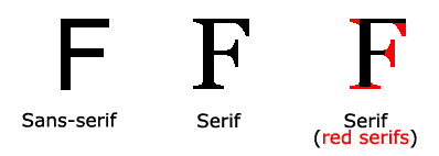
Source: W3Schools
Take this example CAVA Dips, who utilizes an easy-to-read serif body font, paired with a more stylized headline and call-to-action.
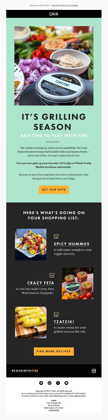
Source: Really Good Emails
While serif is ideal for longer emails, utilizing a sans serif font is still readable and acceptable. With only one line of body text, Cater 2 Me nailed their web font design. It packs a punch and gets straight to the point without being distracting.
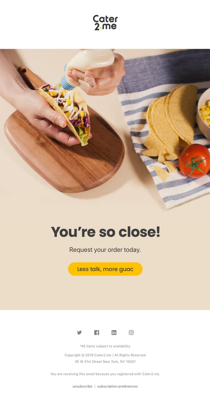
Source: Really Good Emails
2. Use a stylized header with a paired body font.
While this may appear more “simple”, using the same font for your header and body will help establish a better brand identity and ensure that the entire message will appear in the email client. When developing your email, ensure that the header and body are different sizes and have varying padding and styling to better differentiate between the two. It’s also important to note that the more web fonts you have, the longer your email will take to load—which is another advantage of using only one font.
Take this example from Lululemon. The company utilizes headings that are 2x the body text with sufficient padding between the two. Subscribers can easily differentiate between the two elements while creating a clean, classic design.
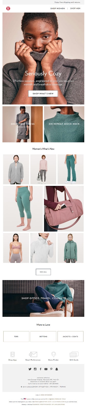
Source: Really Good Emails
However, if you want to be more creative, pairing different fonts together that complement each other can help stand apart in the inbox and keep subscribers engaged. It’s recommended to only use two web fonts per email, but can be tricky because you don’t want the fonts to be unreadable and inaccessible. If you’re looking for a way to discover comparable fonts, you can utilize Font Pair to help find the most impacting font parings for your email design.
Tattly does a great job at pairing two different fonts together while still staying on point with their brand standards. The heading immediately grabs your attention and draws your eyes to the body to see what the sale entails. Due to the imagery, you can tell this brand is more light-hearted—so the multiple fonts work.
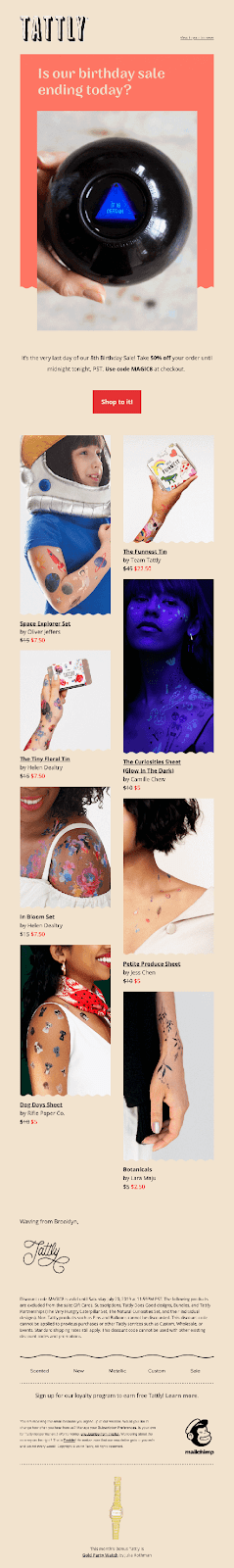
Source: Really Good Emails
3. Create a consistent font structure.
After you have your web fonts selected, you have many other elements to consider like font size, spacing, links and buttons, colors, and more. These features will help keep your emails stay consistent no matter what stage in the customer journey your subscribers are in.
-
Font: For the body text, your font should be sized at 14px on desktop and 16px for mobile devices. When using a responsive design, verify that your email-supported fonts will automatically fluctuate between screen sizes.
-
Spacing: Especially between your heading and body text, ensure you have a wide line-height between 22px and 24 px. Spaces that are too narrow can decrease readability and engagement.
-
Links and Buttons: When creating links and buttons, do not use a separate font to underline your focus phrase and verify if it includes the anchor link. Buttons are a great stylized way to draw attention to your call-to-action.
-
Colors: Only use three colors that identify with your brand standards—one color for your header, one for your body, and the last for your links.
Wrap up
If you’re considering using web fonts in your email campaigns—we say go for it! Web fonts are a great way to captivate your audience and help turn your prospects into customers with impactful email design. When choosing your email-supported fonts, be sure to:
-
Create backup font-stacks
-
Utilize a serif font style
-
Pair header text with the body text
-
Develop a consistent font structure for all future campaigns
Are you ready to start designing your own email campaigns with web fonts? Emma offers both a drag-and-drop editor and the ability to code emails completely from scratch. Try out a demo today to learn more!
About the Author
Emma is an email marketing platform that gives you all the tools you need to send campaigns that really connect with your subscribers. With our
More Content by Emma Email
MOST RECENT ARTICLES


Want to engage your audience and grow your brand? Try Emma's robust easy-to-use product today.