How to choose a color scheme that increases email conversion rate

The fundamental reason marketers spend billions of dollars on billboards, ad space, and yes, even email is one—to draw attention to their products or services.
While flashy billboards and award-winning TV ads are hard to ignore, email is another story altogether. That’s due to its limited functionality when compared to its more advanced counterparts.
However, the humble email manages to pull in $44 for every $1 spent.
But in order for you to enjoy those returns on your investment, you’ll have to master the different facets of email marketing.
One of them is how the color scheme of your email affects your conversions.
Sound like small potatoes? Yet it is true. We live in a world of color, and our eyes can distinguish 10 million of them out of an infinite number of colors.
According to science, color does more than make the world pretty. It affects our behavior. Yes, even in emails.
When it comes to email conversions, most marketers focus on the science behind bigger aspects like subject lines, pre-header text, and email copy. The affect of color on readers is often overlooked.
Colors evoke different moods.
Research has shown that colors have a significant influence on the way we feel. In fact, certain colors actually influence our behavior—particularly buying behavior.
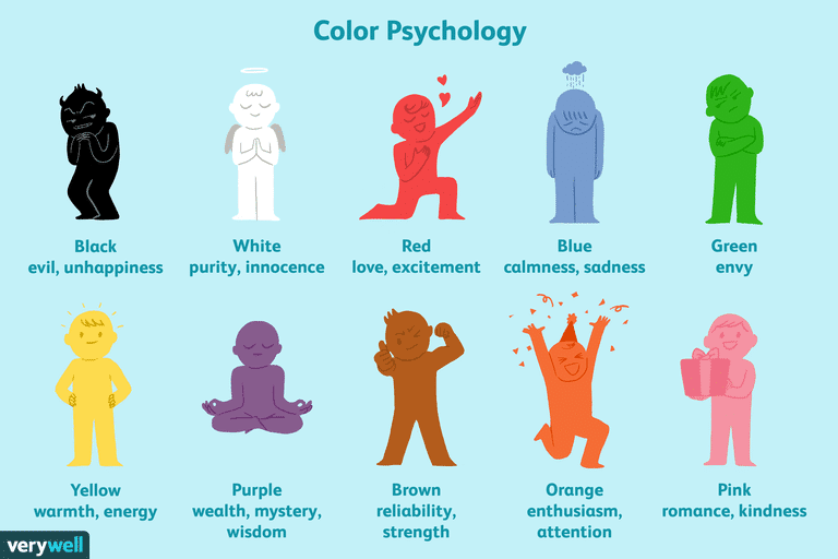
Image Source: Very Well Mind
We will take a look at how different colors affect our psychology in a moment, but by using the right color scheme, you can influence the way your subscribers feel about you and your brand.
Let’s briefly look at the emotions some of the most common colors evoke.
Red
Red is the color of excitement, passion, energy, or action. Red also encourages appetite. Hence Coca Cola’s choice of red for its brand color. That’s why they also use the word happiness a lot as it bolsters the feeling of excitement the color triggers. Marketers also love red as it commands attention.
Orange
Orange signifies creativity, fun, adventure, enthusiasm, and success. Home Depot has adopted this color for the creativity that it inspires in its customers.
Yellow
Yellow, like the sunshine, inspires optimism, cheerfulness, and positivity. If your brand has a “cheerful personality,” yellow is a good color to use in your branding and emails.
Blue
Blue evokes feelings of stability, trust, harmony, confidence, peace, and calm. Using a blue color scheme in your emails will position your brand as reliable and trustworthy.
Green
While green is generally portrayed as the color of envy and jealousy, it also has some positive emotions it elicits. A few examples include health, growth, fertility, wealth, and generosity. If you’re in the health and fitness niche, this is a color to consider in your email designs.
Purple
The color usually associated with royalty, purple also has some other connotations you can put to use in your email marketing strategy. Purple is connected to power, luxury, wisdom, and spirituality, among others.
Colors trigger memories
Colors play a significant role in triggering our memory. That’s why understanding color psychology is important for marketers. By understanding how colors affect your customers, you can use that knowledge to keep your brand top of mind.
For example, if you look at a red can from afar, you immediately think Coca Cola.
That is why you need to invest time and money in nailing the color scheme of your emails. The colors you use should remind your subscribers every time they see them—anywhere.
This is important as people usually buy what they feel familiar with. And the first stage of identifying a familiar brand is, you got it, color.
Let’s take a look at some of the ways you can harness the power of color to help improve your conversions.
1. Understand that gender plays a role.
When it comes to color psychology, one important factor you need to consider before implementing your favorite color scheme is that gender plays a role when it comes to color. And a big one at that.
Because women have an extra color photopigment in their eyes, they see the color spectrum slightly differently from men. And this causes them to prefer certain colors over others. The image below shows the differences in the preferred colors between males and females.
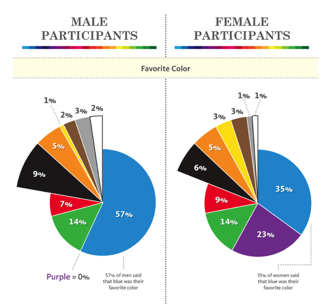
By understanding these differences, you can improve the conversion rate of your email campaigns by segmenting your email list according to gender and using the preferred color scheme for each.
2. Give your CTA button more life—with color.
One of the most critical elements of your email is the call-to-action (CTA) button. Because it is the key element in driving your subscribers to take action, a lot of research and work has gone into crafting the perfectly irresistible CTA button.
If you are looking for ways to increase conversions, your CTA button must not only be well-designed, but it must feature the right color—a color that drives action.
Bright colors are your best bet when it comes to designing a CTA that your subscribers can’t help but click. This is because bright colors, like red, inspire excitement, action, and most importantly, urgency.
3. Use contrast.
Another great color hack you can use to increase the conversions of your emails is by using contrast. A technique that has been used by artists for millennia, contrast is also beneficial to you when it comes to conversions.
Contrast works on a psychological principle called the Isolation Effect that says the element that stands out the most is more likely remembered. For your email marketing strategy, this means ensuring the most important element must have a contrasting color to the main color scheme. And most of the time, that important element is the CTA.
4. Feature images with a relevant color.
Emails with images have been known to increase engagement more than those without them. However, it’s not just any beautiful image that will help you drive those conversions. You’ll need an image with colors that not only blend well with your color scheme but elicits emotions in line with the purpose of your email.

Image Source: Campaign Monitor
Consider the example above from Jaybird. The image is simple yet powerful. It tugs at the heart as the vibrant, bright color inspires excitement. And for most audiophiles, excitement is part of the music experience. Thus the brightly colored image will likely elicit a click on this CTA.
Remember, images should feature a color relevant to your message or product.
What if you are in a more reserved industry? Let’s say you are a dentist. You’ll want to inspire serenity and confidence in your subscriber, so your image must predominantly feature calming and soothing colors like blue or white. Because these colors inspire serenity, calm, and confidence, your subscriber will readily click on your offer.
Random images won’t be helpful if you’re looking to increase conversions. You’ll have to be strategic in your choice of image, particularly the predominant color in the image.
3 tips to ensure your email color scheme improves your conversion
Color psychology is a powerful concept that every email marketer has to master. In order for you to drive maximum conversions, you’ll need to implement some best practices. Here are three of them:
1. Your color scheme must match your brand.
As fun as it is to play around with colors, when it comes to conversions, it’s best to align your email color scheme to your brand colors as much as possible. This is because colors play a huge role in brand recognition. Deviating from your brand colors may cause your subscribers to be confused and possibly question the authenticity of your email.
2. Test which colors work best.
Testing is a crucial part of running a successful email marketing campaign. Because people have personal preferences when it comes to color, you have to determine which color scheme works best with your email list. By trying out different colors, you will have insight into the color scheme that drives the most conversions.
3. Don’t overdo it.
Remember, your subscribers are looking forward to an informative email from you, not a piece of art. Keep everything simple and clean. While adding color to your email will give it more life, too much color might kill it. That’s because overdoing your colors may actually end up having the opposite effect. For example, too much red signifies danger and can lead to frustration, while too much orange can paint a picture of immaturity.
Wrap up
By understanding how different colors affect your subscribers and influence their behavior, you are better equipped to pull off some very successful email marketing campaign. However, color alone is but one element of a high-converting email.
Keep these points in mind:
-
Use color in your call-to-action
-
Rely on contrast
-
Choose images with feature colors
-
Match your brand
For more tips and hacks on increasing your emails conversion rate, check out this ultimate guide on improving the results of your emails.
About the Author
Emma is an email marketing platform that gives you all the tools you need to send campaigns that really connect with your subscribers. With our
More Content by Emma Email
MOST RECENT ARTICLES


Want to engage your audience and grow your brand? Try Emma's robust easy-to-use product today.