Email showdown: Verizon vs. AT&T vs. T-Mobile
A breakdown of customer nurturing emails from top wireless carriers
As far as I'm concerned, 2018 should be declared the year of customer engagement.
For one thing, your base of existing customers is arguably your most valuable audience. You've already won them over, which means they have a way higher chance of converting (via upgrades, additional purchases, etc.) – 60-70%, versus 5-20% for new prospects. Plus, keeping them happy means improving your retention, which is huge if you want to hang onto that crucial stream of predictable revenue.
Yet marketers continue to ignore their customers in favor of chasing down fresh new leads. Customer nurturing isn't something we see a lot of brands doing well, so for this showdown, I wanted to take a look at how the three top wireless carriers – Verizon, AT&T, and T-Mobile – communicate with their existing customer base through email marketing.
I'm an AT&T customer, and thankfully, two of my teammates happen to be Verizon and T-Mobile customers. So here's a look at some of the most recent emails we've gotten from these brands, plus my evaluation of which one provides the best customer experience in the inbox.
VERIZON
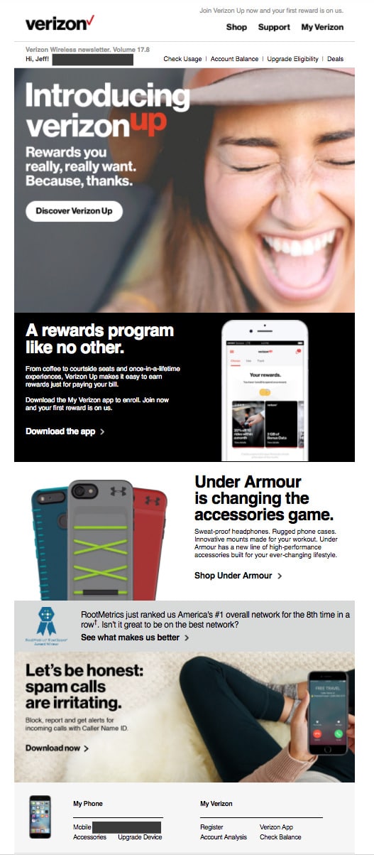
1. Subject line: "Jeff, it's here — a reward program that's better than ever."
As you can probably tell from subject line, I didn't get this email. It was forwarded to me by way of Jeff Slutz, Senior Content Strategist at Emma and loyal Verizon Wireless customer.

That's Jeff!
This particular edition of their newsletter happened to announce the arrival of their new rewards program, VerizonUp. The subject line is a little long, but they smartly front-loaded the most important part of the message to combat cut-offs, and the first name personalization was a nice touch.
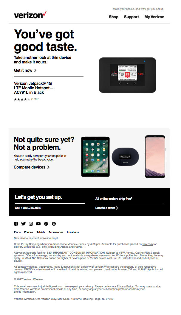
2. Subject line: "Got a new device on your mind?"
I will give them this: Of the three carriers, Verizon is the only one that seemed to be automating based on behavior. This email is excellent, from the short and sweet subject line to the super relevant content. Since they knew Jeff was looking at this particular device, the quick little reminder was both relevant and timely.
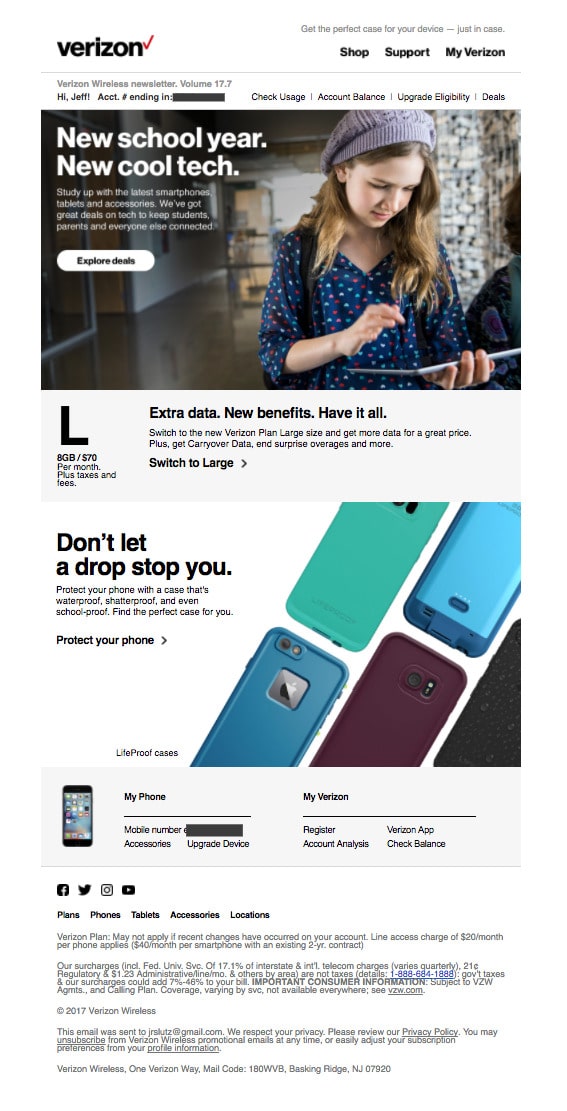
3. Subject line: "Jeff, we're covering everything your student needs."
However, this email missed the mark. Jeff is a dad, yes, but his boys are still toddlers, so they won't be going to school (let alone using tablets) for quite a while. It wasn't irrelevant enough to be annoying, but for a company like Verizon with tons of customer data at their disposal, they probably could have segmented this send a little better.
T-MOBILE
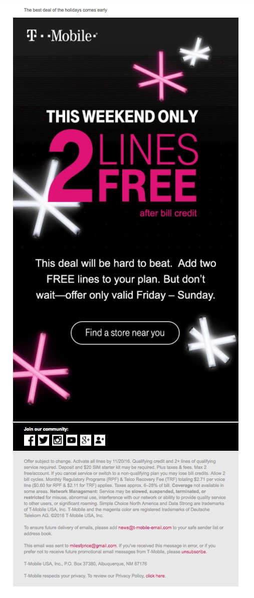
1. Subject line: "Offer ends Sunday—get 2 lines free after bill credit!"
This email came from Miles, Product Marketing Manager at Emma and recent T-Mobile convert.

That's Miles!
Knowing what I needed his examples for, Miles was quick to note that he gets A LOT of email from T-Mobile, so the send cadence could probably be scaled back a bit.
However, it is pretty clear from this first campaign he sent me that their design team understands the importance of mobile. The email looks fantastic on a small screen, and the button is easy to tap on a smartphone.
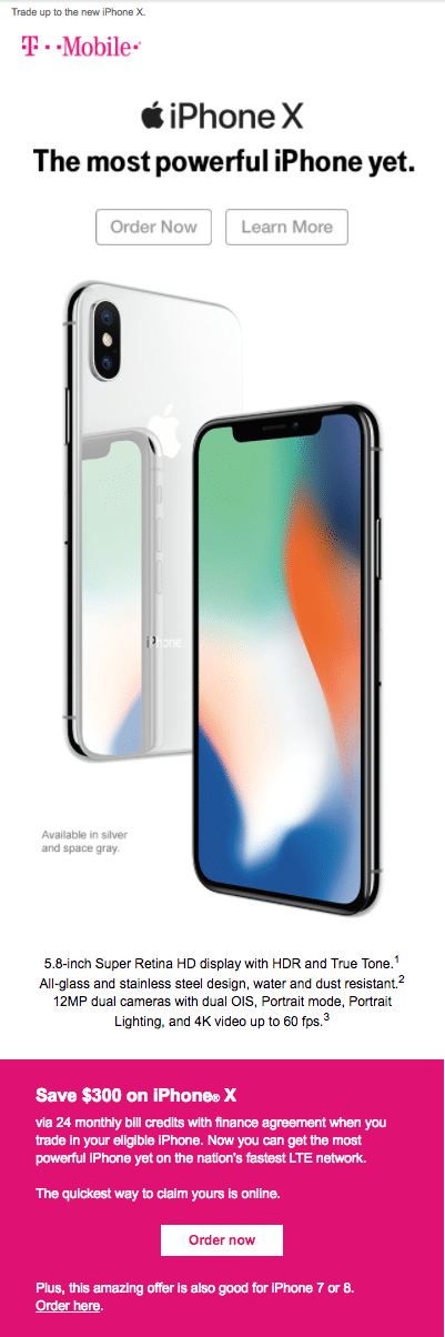
2. Subject line: "Order your iPhone X now"
I love how simple they kept this big announcement campaign, allowing the new iPhone to steal the show. Plus, while I generally prefer a single CTA button in a dedicated email, the choice to include two here was pretty smart.
While some subscribers may have known enough about the new iPhone to be ready to buy right then, many were probably still in the discovery stage. So offering the choice to simply "Learn more" allowed those subscribers to engage without having to immediately commit to a purchase.
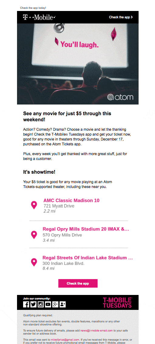
3. Subject line: "It’s on. $5 ticket. Any movie. T-Mobile Tuesdays."
This. Email.
I was reasonably impressed with this one from the moment I saw it. T-Mobile does a thing they call "T-Mobile Tuesdays," where they offer their customers special deals on various activities and products. This particular edition was all about $5 movies. It featured a fun GIF up top, and they even used dynamic content to pull in the closest participating movie theaters.
... but then, in the name of fairness, I opened it again on mobile to see how it looked compared to Verizon's campaigns.
It was a solid mobile experience, but that isn't what captured my attention. When I opened the forwarded email at our office in downtown Nashville, it pulled in the three closest movie theaters to me at that moment.
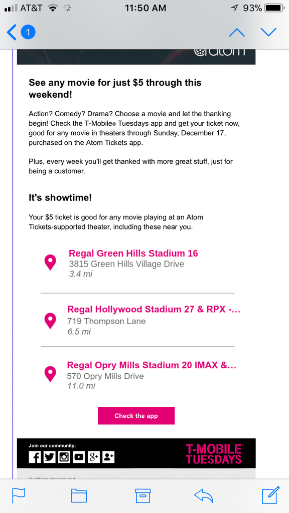
I'm not on T-Mobile's email list – and besides, this was a forward from Miles.
So that means they aren't using dynamic content that pulls in content based on their audience data. Rather, they're using Movable Ink, a tool that allows for point-of-open personalization. Very few brands are doing such complex email personalization at this point, so this little element alone shows that they're truly invested in providing the best, most relevant experience to every person who opens their emails.
AT&T
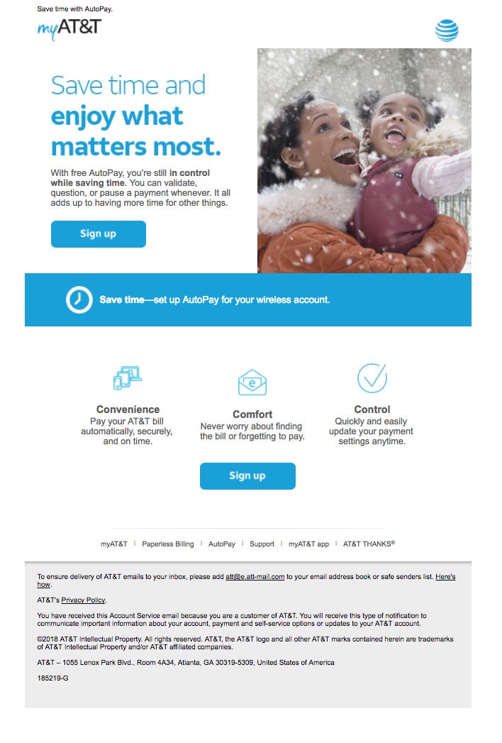
1. Subject line: "Update your bill settings, McKenzie."
The first email I found in my own inbox had a pretty lackluster subject line – in fact, I was a little irritated about the direct order – but the campaign itself was better.
First of all, I appreciate the value proposition they used to try and convince me to switch to AutoPay. It was both practical and emotional: Not only will you save time (practical), you'll save time and be able to spend more time with the people you love (emotional). The three illustrated icons help to emphasize that point, and the whole campaign remains focused on a single call to action: Sign up.
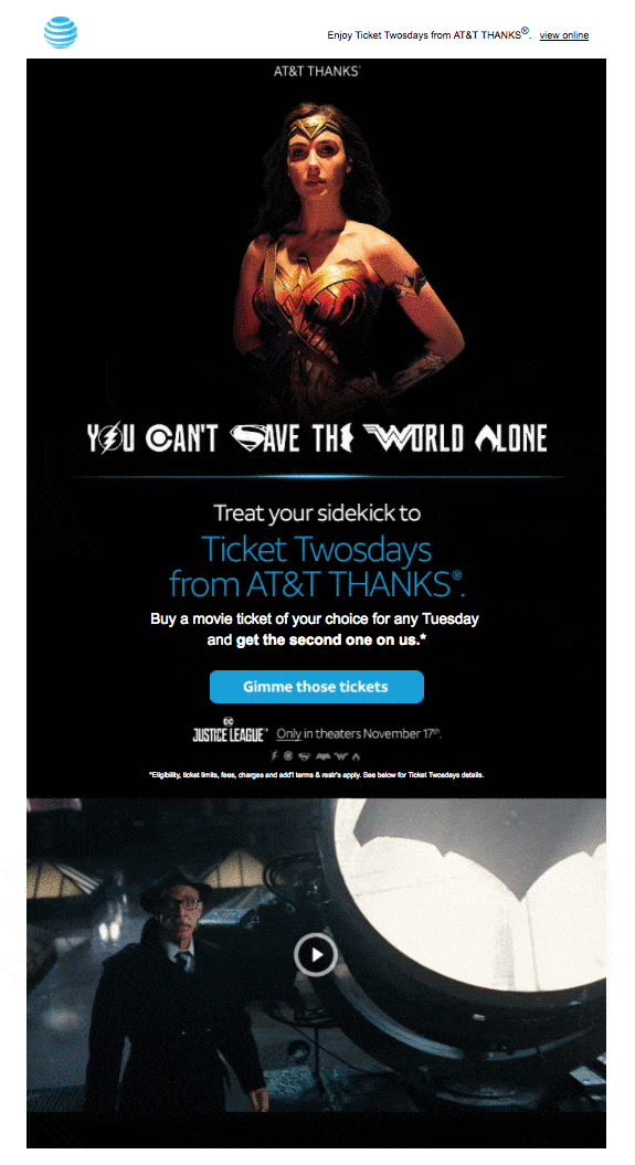
2. Subject line – "Tuesday is for you and your sidekick."
Like T-Mobile, AT&T offers their customers special deals on Tuesdays.
This time, it was a buy-one-get-one movie ticket offer, and they focused the email around a trending movie at the time, Wonder Woman. I absolutely love the design here: The black background helped the campaign stand apart from their business-as-usual emails, and including a GIF as the video thumbnail was a super smart choice to amp up interest and keep people scrolling to find out more.
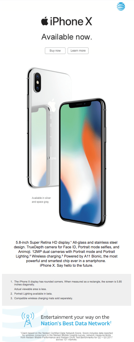
3. Subject line – "McKenzie, your new iPhone X has arrived!"
No. Just, no.
Testing out different types of subject lines is great, but you should never, ever try to mislead your subscribers in an attempt to boost opens.
Instead of telling me what the email was actually about (the new iPhone X has arrived), they tried to capture my attention by using a subject line that implied I ordered one (I had not). While a strategy like this may have gotten them a higher open rate than usual, I seriously doubt it improved conversions.
THE VERDICT
So, here's what we're looking at...
Verizon:
Pros – Great use of automation based on behavior
Cons – Poor mobile experience
T-Mobile:
Pros – Savvy use of design and incredible personalization tactics
Cons – High send frequency compared to the others
AT&T:
Pros – Fantastic customer rewards emails
Cons – Lackluster (and sometimes misleading) subject lines
I was actually pretty surprised how well all three brands performed in this showdown. While they all have areas where they could improve (who doesn't?), they're all doing a pretty solid job as far as content and design go.
It makes sense: In an industry this competitive – especially one where it's relatively easy for consumers to make the switch – it's absolutely vital to continually build customer loyalty. That's why I think there's a clear winner here. With a dedication to providing the best inbox experience for every subscriber across devices (plus one of the coolest email personalization examples I've ever seen), I have to give this one to T-Mobile.
WINNER: T-MOBILE
Updated on 1/31/2018 to remove the section about T-Mobile's preheader text. When you search a Gmail inbox, their preheader displays the search string and adjacent HTML – something that happens to the majority of brands. However, their preheader text looks good in the normal inbox view, so we won't dock them a point for that!
MOST RECENT ARTICLES


Want to engage your audience and grow your brand? Try Emma's robust easy-to-use product today.