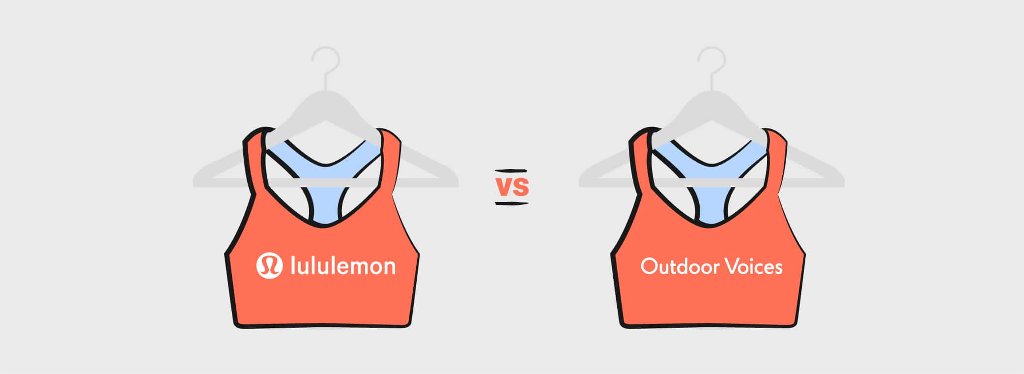
Email Showdown: Lululemon Vs. Outdoor Voices
Happy New Year from all of us at Emma! While the arrival of 2019 provides a post-holiday breather for many in the retail and entertainment industries, there’s one industry still standing at the starting line, and it has everything to do with resolutions—fitness, of course.
While our inboxes are quieter than usual in this season, we’re keeping our eyes on a few companies eager to help with everyone’s goals to be healthier, happier, and more fashionable. This is peak season for athletic wear brands Lululemon and Outdoor Voices, and we’re excited to see who comes out on top of the first email showdown of 2019.
LULULEMON
The sign-up process
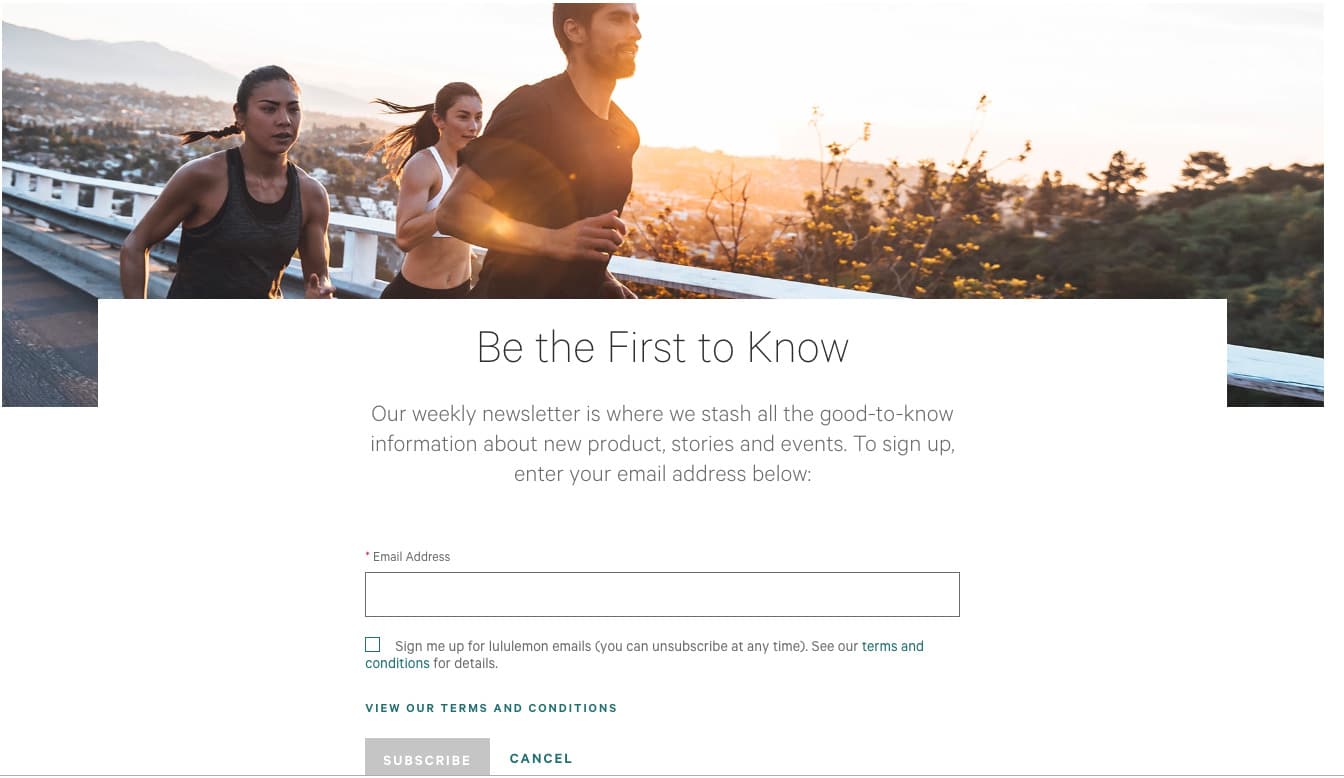
There are a few options when it comes to email signup, which shows that Lululemon has taken a unique approach when it comes to building and growing their email lists.
There’s the weekly Lululemon newsletter sign-up, shown above, which is specifically for this publication. They say exactly what you’ll receive by signing up, and they ask for the bare minimum information, which most likely works to their advantage. Asking for too much information can deter users from signing up, so this is definitely the way to go in this case.
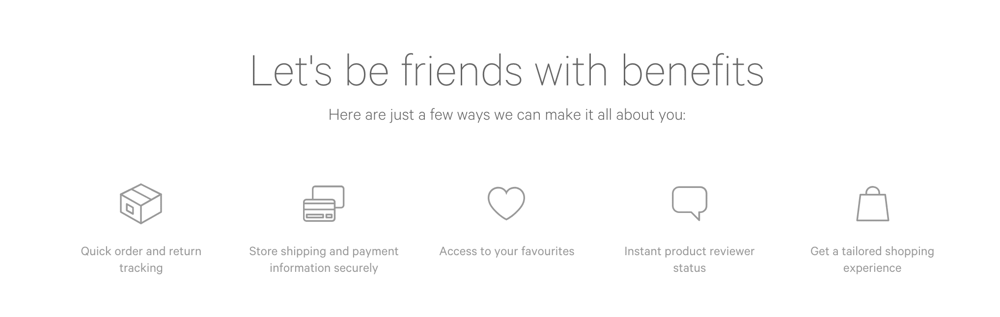
But there’s also another option, which is the easiest to find on their website but doesn’t necessarily imply email marketing, which is “Sign in” or “Make an account.” Fortunately, as soon as you click one of these options, they make the purpose clear and specifically name the benefits of signing up:
1. The welcome email
Subject line: Welcome to the collective!
Preheader text: Get the latest gear and freshest stories here, first.
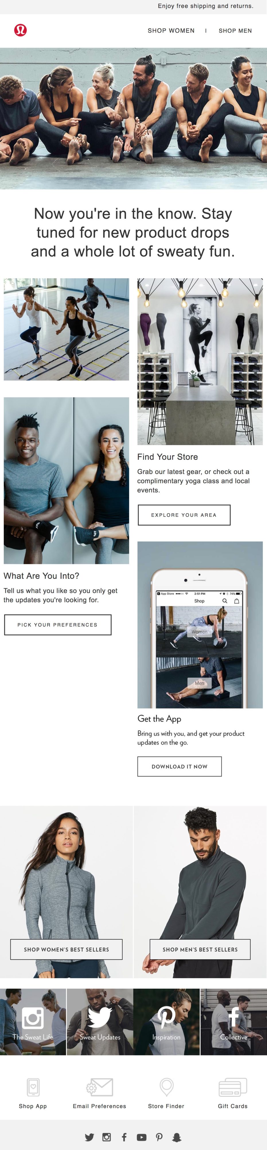
This welcome email is a warm introduction to not only the Lululemon brand but also the community that surrounds it.
Usually, our best email marketing advice is to have one call-to-action per email, but I think I’m going to let it slide here. A welcome email is the first thing that all of your customers will encounter after signing up, so making it too specific could give them the wrong impression of your content and drive them to unsubscribe, which you definitely don’t want.
The multiple CTAs aren't confusing, and the email is clean and minimalistic, allowing the copy to be a little more complex. Whether a new user is looking to find a store in their area, update their email preferences (Bravo, Lululemon!), or find out more about the company, this email acts as a navigation hub that directs them to their destination.
2. The featured product email
Subject line: Get the latest and greatest.
Preheader text: Find your new favorite gear in time for your next sweat.
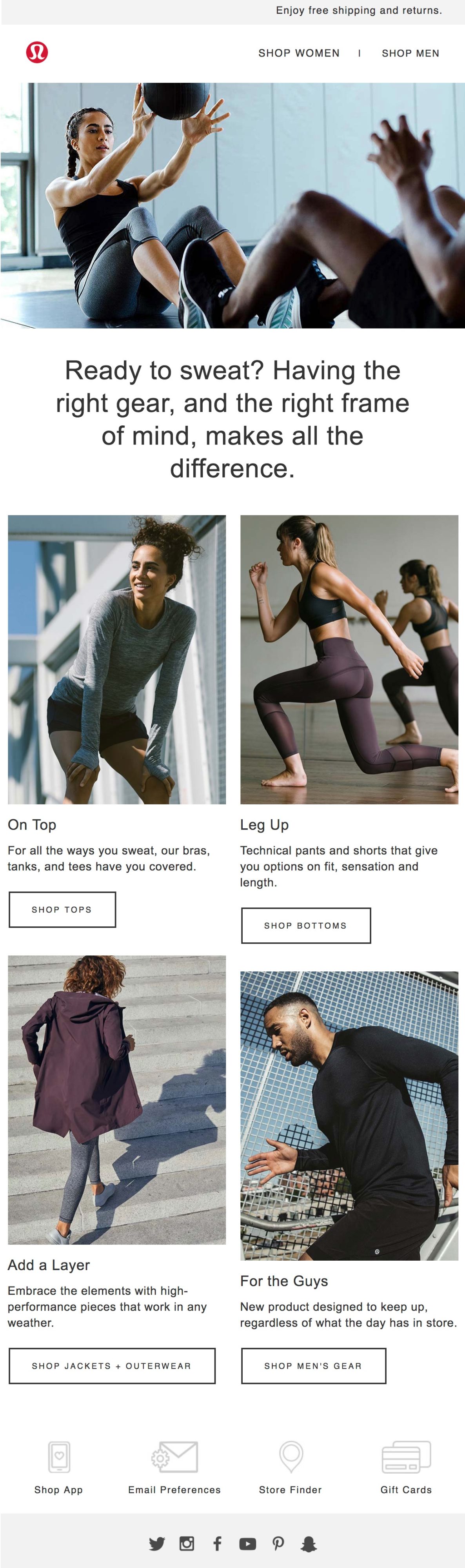
While I called this a “featured product email,” there are actually several products being featured here, and combined, they’re promoting an overall experience, rather than an individual item of clothing.
This message is doing a great job of following the tone set from the first email, but it also doesn’t feel that different. This would be a great time to hone in on a specific part of Lululemon’s mission or use more multimedia, like an interactive GIF or video.
We said the multiple call-to-actions worked for a welcome email, but I’d like to see a little more targeting on the second email—this is an opportunity to feature an item of clothing I previously clicked on or dynamic content tailored to my location. Presenting too many decisions for a customer to make at the beginning of their decision process may result in overwhelm.
3. The New Year’s email
Subject line: Crush your first 2019 goal.
Preheader text: Kick off 2019 with the Lululemon 40|80 challenge.
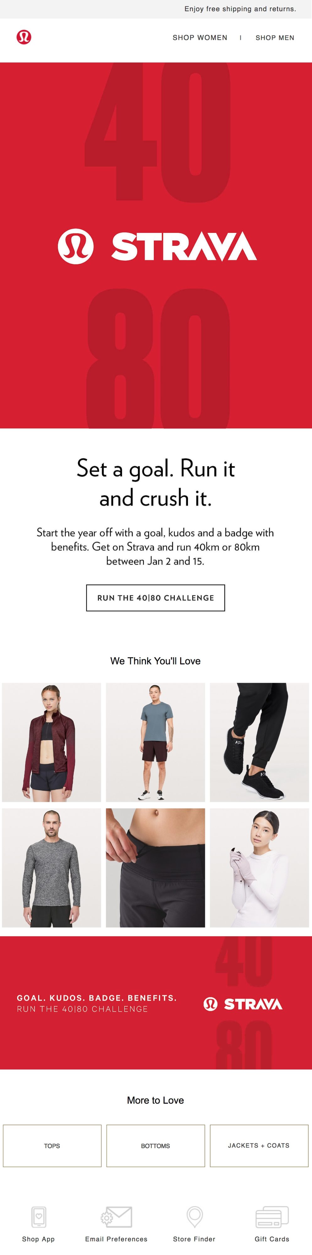
New Year’s is the perfect time for fitness companies to send email blasts and make the most of resolution-making season, and Lululemon does just that. They’re approachable yet inspiring, making a customer’s fitness goals the focal point of the email, while subtly suggesting how they can help.
This is a great time for Lululemon to feature their partnership with Strava, a fitness activity tracking app, and the 40|80 challenge is the perfect way to get customers excited about their products for the near year.
4. The product close-up email
Subject line: Snuggle Up to a Favourite
Preheader text: This fleece keeps your body heat where it belongs.
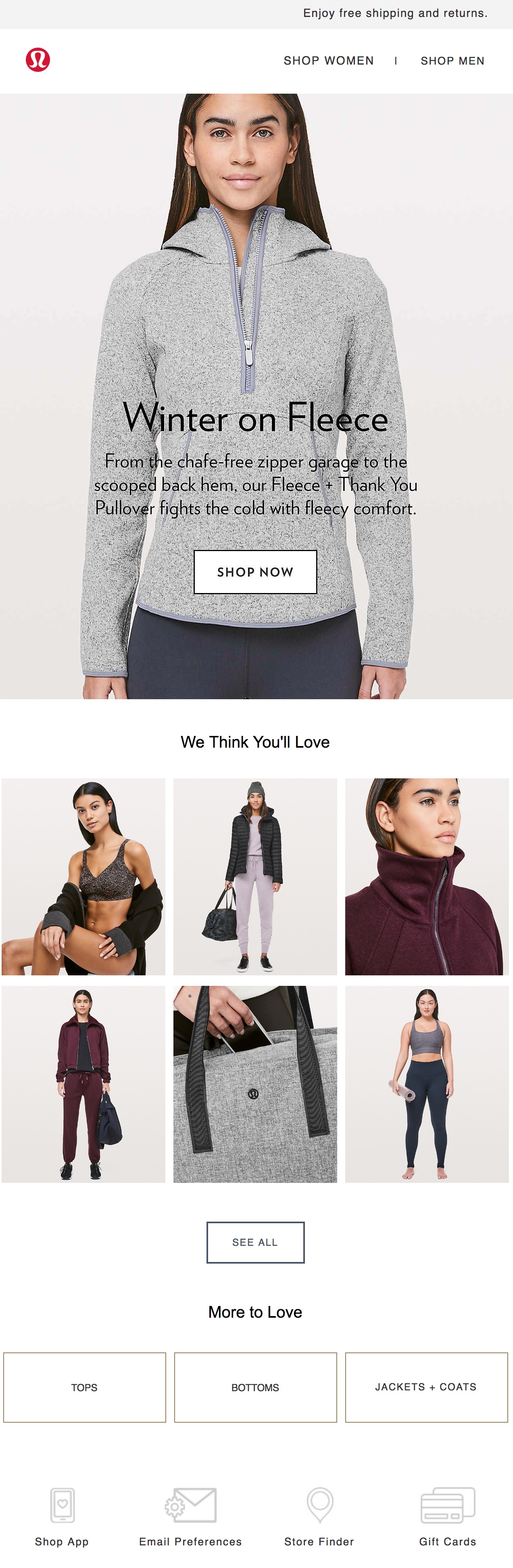
This is the product email I’d like to see earlier in the email marketing cycle. Lululemon’s clean design gives a high-fashion vibe to their clothing items, but they don’t skip the details athletes care about, such as “chafe-free” and “fights the cold,” a nod to the fleece’s performance in all conditions.
Combined with a simple grid of related products, this email’s streamlined appearance really breaks away from the traditional athletic wear look, instantly making Lululemon’s products seem higher quality and more sophisticated.
Now that we’ve seen what Lululemon has to offer, let’s look to its contender...
OUTDOOR VOICES
The sign-up process
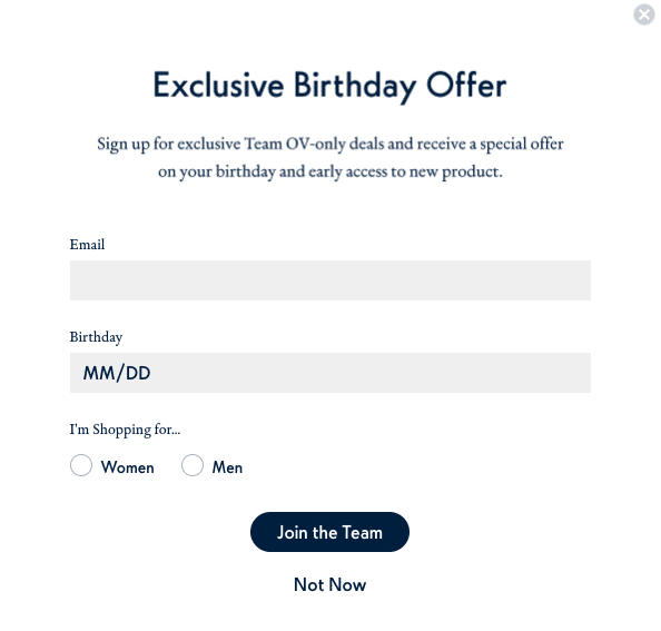
As soon as you enter the Outdoor Voices website, you’re greeted with a pop-up, which gets an especially bad rap these days. But hear me out—if you’re going to use pop-ups, they should always be something that surprises, delights, or adds value to the reader’s life. For instance, birthdays. Who doesn’t like celebrating their birthday? When customers know they’ll receive something in return, they’ll be much more likely to provide their email address, and an exclusive birthday offer fits perfectly.
1. The welcome email
Subject line: Thanks for stopping by!
Preheader text: No longer want to receive these emails? Unsubscribe.
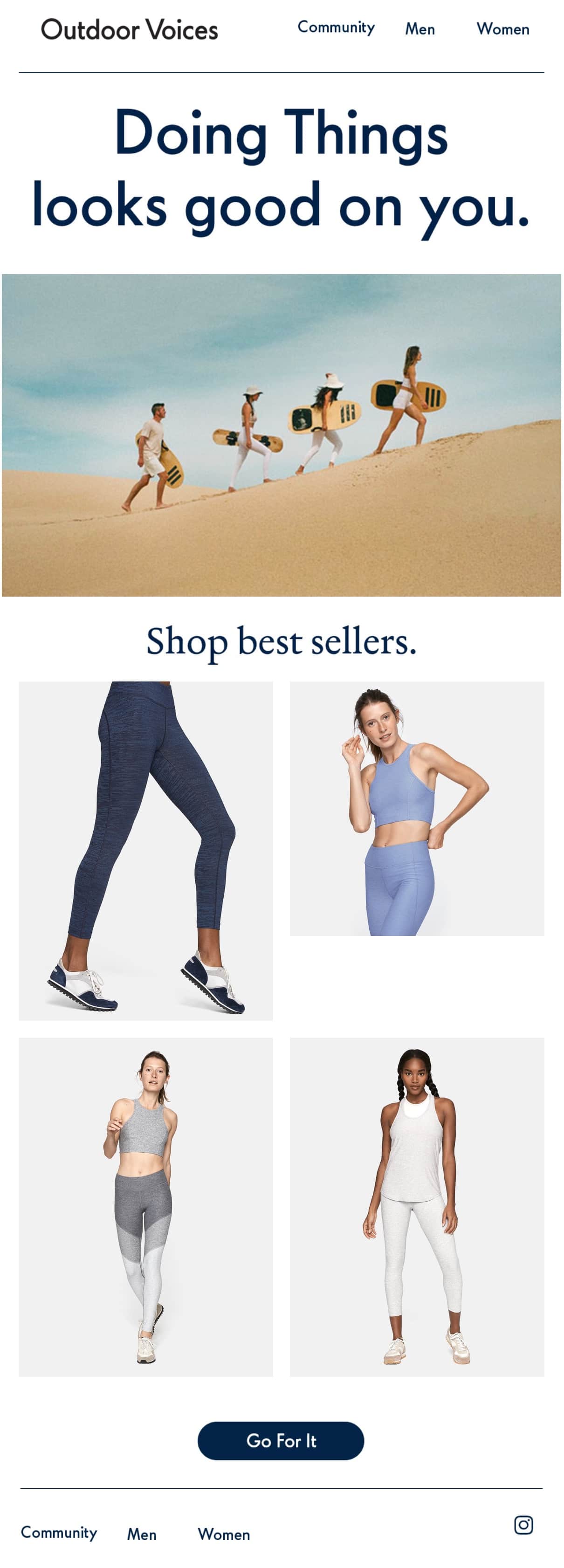
Outdoor Voice’s “Doing things” slogan is a creative and welcome voice in the fitness industry, and they made the right move in putting it front-and-center of their first email since it is messaging that will continue to set them apart from competitors. Although they feature several items of clothing, there’s one main call-to-action, giving the user a clear next step.
It should probably be noted that other clothing companies and retail stores who don’t specialize in fitness may not be able to get away with as many featured product images. The mix-and-match characteristic of fitness wear allows the multiple photos to come across as additional options or ways to wear the same piece, rather than overwhelm that leads to decision fatigue.
2. The featured product email
Subject line: Have you tried our best material for sweaty activity?
Preheader text: N/A
Nice job, Outdoor Voices! Here we see a single product close-up that features a GIF—and honestly, if any industry was practically created to use GIFs, it’s the fitness industry. This one cycles through action shots of various mix-and-match athletic gear and the photos below it show off additional features that aren’t covered in the gif.
Also notice the color scheme: Although Outdoor Voices offers workout gear in a variety of colors, where they’ve chosen to display those that coordinate with their chosen brand palette. It creates a cohesive look, allowing the GIF to really shine.
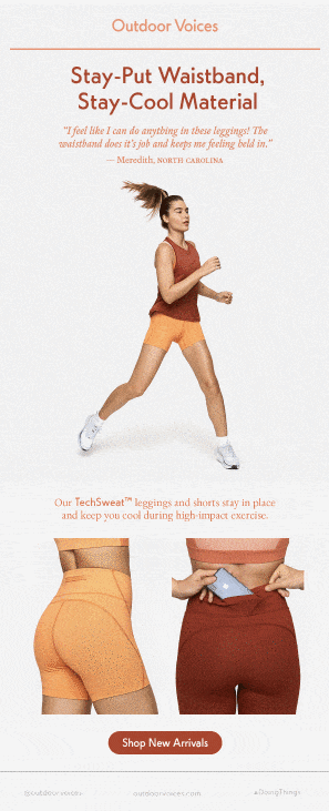
3. The best of 2018 email
Subject line: Shop the best of 2018.
Preheader text: N/A
While Outdoor Voices didn’t jump on the New Year’s resolution train with as much enthusiasm as Lululemon, they did do a review of 2018 featuring customer testimonials that don’t disappoint. And this is where authenticity really pays off. The brand itself wouldn’t say something like, ”I would get married in these shorts,” but your best friend probably would. Featuring these testimonials (and they are super interesting!) adds a vital human element to their brand, and it makes us love them even more.
4. The triggered email
Subject line: Did you see something you liked?
Preheader text: N/A
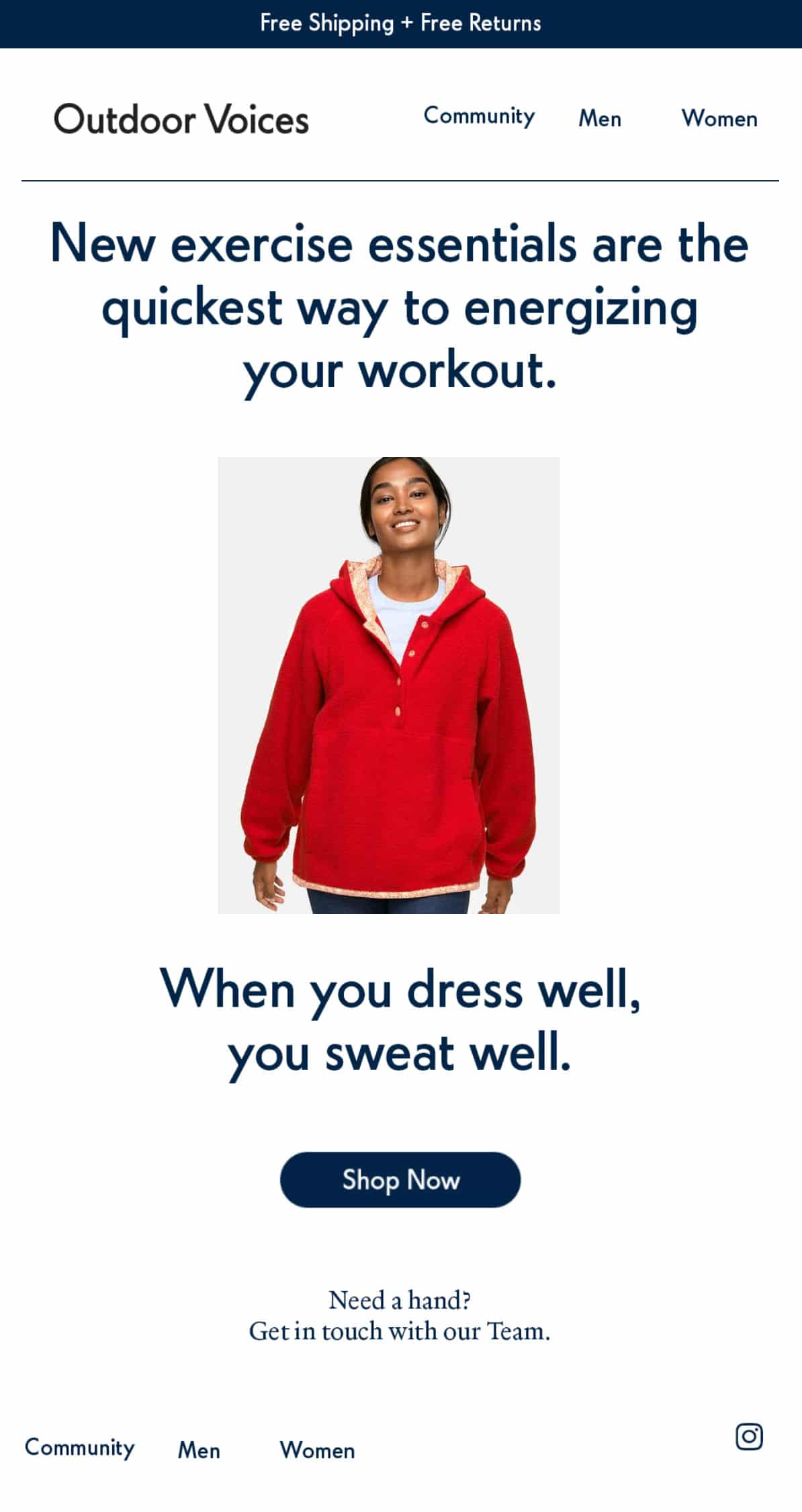
I was browsing the Outdoor Voices site and landed on this red fleece. The next morning, I got this email. How do they do it? Through web activity tracking.
I didn’t even click something directly from an email or tell them the color I liked best, but because I was already subscribed to their emails and they picked up on when I browsed their website. In some cases, this could be creepy, but in this case, I appreciate that they paid attention to my preferences and wanted to help me out.
The verdict?
I’ve seen a lot of emails, but this is probably the hardest choices I’ve had to make to date. Lululemon does a great job of remaining consistent and letting the product speak for itself while the design and copy support in the background. However, I’d like to see them experiment a little more with multimedia and take a few risks with surprising their customers with different content.
Outdoor Voices, on the other hand, does a great job of keeping us on our toes with gifs, customer testimonials, and customized messages. I’m surprised they didn’t take more advantage of a new year and fresh start, but the content they did deliver was extremely satisfying.
WINNER: OUTDOOR VOICES
About the Author
Kaitlin Wernet is a content specialist on Emma's marketing team. When she's not restraining herself from using too many exclamation points or grabbing one more La Croix from the office kitchen, she can be found working on her first book or planning her next big travel adventure.
More Content by Kaitlin Wernet
MOST RECENT ARTICLES


Want to engage your audience and grow your brand? Try Emma's robust easy-to-use product today.