9 Keys to ensure your emails are responsive

When you design an email, what are your main concerns?
You may think about getting the content right, making sure you have the best images possible, and figuring out the best day and time to send your emails to your list.
If this is what came to your mind, you’re not wrong. These are all important aspects of email marketing. However, there’s one thing that’s increasingly important to every email campaign: responsive email.
A responsive email is one that can be seen easily across every device, from laptops and computers to smartphones and tablets.
What can you do to ensure that your future emails are responsive?
We’ve compiled a list of everything you need to make sure your audience receives your beautiful emails, no matter what device they’re on. We look at the design, content, and technical aspect of how to make emails more responsive.
What does it take to create a responsive email? You need to make sure your emails are:
- Mobile friendly
- Tablet friendly
- Responsive across various email programs
- Responsive across a variety of browsers
- Designed to avoid spam filters
There’s a lot to think about in order to design responsive emails, but we’re here to help make the tasks easier than ever.
Here are nine ways to ensure your emails are seen by everyone on your email list, no matter what device they’re on.
Optimize your design for mobile devices
These first 3 tips are ideal for optimizing your design for mobile devices.
1. Watch your font size.
No matter what device you’re designing for, font size is important. If you choose a font size that’s too small, it will be difficult to read—even on a computer or laptop. You can imagine that if the font is too small on one of those devices that it’s going to be nearly impossible to read on a smartphone.
Another issue is using fonts that are too large. For one thing, it can look unprofessional, like you don’t know what you’re doing. For another thing, it can completely throw off your design for mobile devices.
If your font is too large, the email program will push aside images and headers, making your content look unstructured. Again, this will be difficult to read and most readers won’t have the patience to wade through it.
Your ideal font size is around 13-14 pixels.
2. Image size matters, too.
Images that are too large are annoying to your readers for two reasons.
First, larger images can take a long time to load. People often decide they don’t have enough time to wait for slow emails. Plus, while the images are loading, it can slow down other applications on their phone. More often than not, these types of emails will be discarded.
Second, images that are too large can be difficult to see. Instead of seeing the whole image in a single screen, your readers will have to swipe from left to right or scroll down to see the entire image. For most people, the time and effort to do that just isn’t worth it.
If you have the technical know-how, you can use coding techniques for responsive emails. These techniques will allow you to add smaller images to mobile devices and larger images to emails opened on laptops or desktop computers. Another option is to simply reduce image size by half.
3. Stick to single-column designs whenever possible.

Source: Campaign Monitor
Single column emails will be easier to view across devices. The simpler the design, the better. It can be tempting to go with something more complex and perhaps more visually stimulating. Unfortunately, these types of designs can either take forever to load or they can appear distorted on devices with smaller screens.
How to keep your content mobile-ready
These next few tips will ensure you are keeping your content ready for mobile users.
4. Keep your emails clear, simple, and concise.
Crafting content comes easier for some than for others. But anyone can get into tricky waters when it comes to writing emails. Those who love to write can end up writing a novel’s worth of content because they have so much they want to share. The others can end up filling their emails with fluff because they’re not sure what or how much to write.
A good rule of thumb: Keep things simple.
One of the keys to writing a responsive email is simple, concise copy. Add just a snippet of content to your emails and leave the meat of your content for a blog post or web page.
Think about how you feel when you receive a long email and you have to scroll and scroll on your phone to get through all the content. It’s not fun and gets old really fast.
Grab and hold your readers’ attention by keeping things simple.
5. Your call to action and subject line should be clear and concise, too.
Two other copy components of your email that should be written in a clear and concise manner are the call to action and subject line.
When you receive email on your phone or tablet, there’s only so much of the subject line that you can see. A long subject line that gets lost will not encourage someone to click open the email.
Similarly, your call to action (CTA) should be concise. Just a few words will suffice:
- Watch now
- Shop this sale
- Click here to buy
- Read more
The technical aspect of responsive email design
Lastly, these final four tips will assist you when it comes to the technical aspect of responsive email design.
6. The importance of email housekeeping.
Every so often, it’s important to do some digital house cleaning. In particular, you want to do what’s called email list scrubbing. In essence, you’re removing unengaged subscribers from your email list.
What’s the purpose of email scrubbing? Oftentimes, people don’t open your emails because they don’t always remember subscribing to your list. When this happens, they may mark your email as spam.
Email service providers log spam complaints, which means you can gain a digital reputation with these providers as spam. More often than not, whenever someone new subscribes to your list, your emails can end up in their spam folder, too.
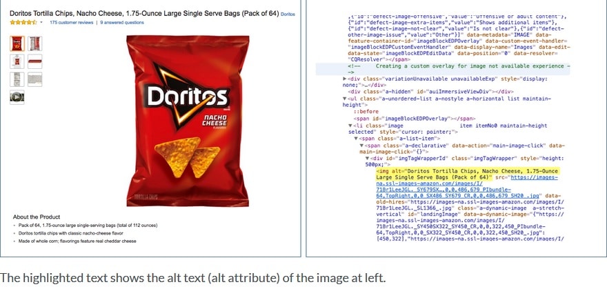
7. Use alt tags for all images, including a call to action image.
Alt tags are descriptions used within your code to describe an image, whether it’s a beautiful graphic you want to add or a call to action button.
Some email service providers won’t always allow images to display within emails. To avoid a missed opportunity, you’ll want to add alt tags. They’ll show up in place of the image. It will give the recipient an idea of your intentions and let them know if they need to take some sort of action, as is the case with a CTA button.
In the image below, notice the yellow highlighted code on the right. This is the alt tag for the image of the bag of Doritos chips.
Source: Moz
The following image shows some best practices when it comes to writing your alt tag text.

Source: Moz
8. Do your best to avoid your subscribers’ spam folder.
One of the goals of email marketing is to avoid ending up in your subscribers’ spam folders.
Here are two important ways you can go about doing this.
The first is transparent configuration practices. Spammers use obfuscation techniques, which can disguise their origin. Anti-spam software looks for fake domains and return paths. To avoid being identified as spam, try using a verified domain. Plus, the “from” field and return path should both match the name of the domain that you’re sending your emails from. You can also authenticate your email using:
Also, try to avoid using spam words in your emails. Spam word, particularly in your subject line, is one of the fastest ways to get tagged as spam. Use personalization whenever possible, avoid using punctuation and symbols in the middle of words, and avoid words that sound sales-y and spammy.
9. Test your emails for responsiveness before sending them out.
Whether you’ve been sending out marketing emails for a while or are just starting out, you’re always going to be concerned with trying to improve your results. You want improved open rates, click through rates, and conversion rates, as well as low unsubscribe rates.
How can you ensure improved success with your email campaigns? Regularly test your emails for responsiveness. Before you send your emails, do a test run to see if your emails can be clearly viewed across a spectrum of devices.
Wrap up
When creating a responsive email campaign, you have to pay attention to the content, design, and the technical side of things.
To review, you should:
- Have clear, concise copy, including subject lines and calls to action
- Watch your font and image sizes
- Stick to single column designs
- Use alt tags
- Avoid menu bars and stacking links
- Avoid the spam folder by watching what words you use and utilizing transparent configuration practices.
Are you having trouble finding the best design for your email campaigns? We totally understand! There’s so much to try and remember when designing emails that it can be daunting—and we’re here to help. Contact us to discuss your ideal design with our design professionals.
About the Author
Emma is an email marketing platform that gives you all the tools you need to send campaigns that really connect with your subscribers. With our
More Content by Emma Email
MOST RECENT ARTICLES


Want to engage your audience and grow your brand? Try Emma's robust easy-to-use product today.