30 landing page mistakes that can kill your conversions

Avoid these landing page mistakes & save thousands on lost revenue
Your marketing dollars are important. Yet somehow, while companies spend thousands of dollars on campaigns, they often fall short when it comes to their landing pages and website.
Here’s the thing: The main problem isn’t that landing pages suffer from poor design. Most pages these days are clean and professionally designed, but companies across multiple verticals still suffer from lack of engagement, continuity, and conversions.
Intertwining consistent optimization into all of your campaigns is essential to your success. It’s also critical to look beyond the lens of a single purchase and instead focus on continued engagement for retention. That means during that first touchpoint with the customer, you’re aiming to create a long-term relationship with them.
But are we even there yet?
Landing pages and websites still suffer from basic usability issues.
According to Load Storm and Fast Company, “1 in 4 visitors would abandon a website if it takes more than 4 seconds to load. 46% of visitors don’t revisit poorly performing websites. Every one-second delay in page load time could lead to $1.6 billion in annual losses for online merchants as big as Amazon.”
Think about the last time you clicked on an ad or an email. What was the experience like? Did the page load quickly? Did you see what you expected to see based on the ad? Were you intrigued enough to continue, or did you decide “I’ll check it out later”?
That’s the exact scenario you want to avoid.
Landing pages are built to pique visitors’ attention, to engage them, to get them to take action, and of course, to retain them. They are the heart of any conversion-focused marketing campaign.
Common best practices aren’t always the answer, either: each vertical, campaign, and value proposition has specific considerations. What applies to one company and one campaign doesn’t apply to all.
However, while the dos vary, there are some don’ts that all companies can benefit from. In this article, I have outlined 30 deadly sins that too many marketers make on landing pages. If you avoid these mistakes, you can save thousands of dollars in lost revenue.
30 killer landing page mistakes
1. Irrelevance
According to MarketingSherpa, 44% of B2B clicks are directed to a home page instead of a dedicated landing page. So, where are your visitors landing? Sending ad traffic to a dedicated landing page helps improve your page relevance, while sending visitors to a page that bears no resemblance to the ad itself leads to confusion, loss of confidence, and desertion.
While we aren’t entirely against sending visitors to a homepage or services page, the pages should show some continuity between what the ad said and the page itself. This becomes difficult when you are running multiple campaigns, and they all lead to the same exact page.
For instance, home pages tend to be pretty general. This means whatever messaging they clicked on to get them to the page will likely not be repeated on the homepage (or will be lost amongst a lot of other content).
2. Basic functionality problems
Sure, broken links happen to the best of us. But apart from occasional errors, there are countless examples we run into on a daily basis where someone failed to consider the user experience.
Recently, my business partner and CEO of our company Khalid received an email invite to attend a marketing event. He assumed it would be easy to RSVP.
Here’s the landing page.
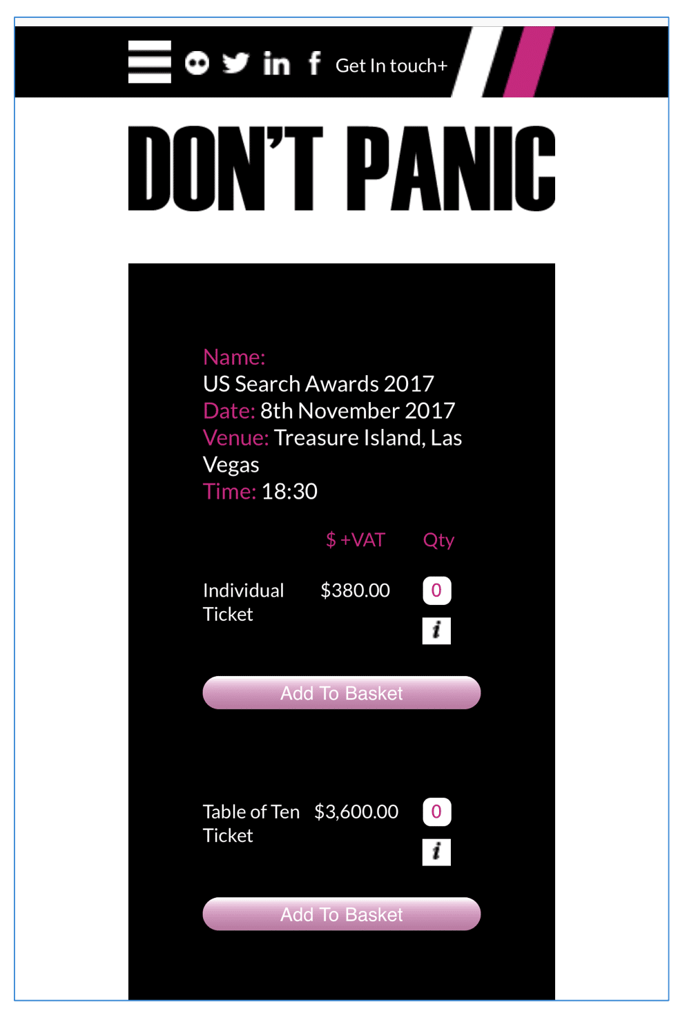
He wanted to attend as an individual, and there was the CTA, “Add to Basket." However, he clicked on it and landed on this page.
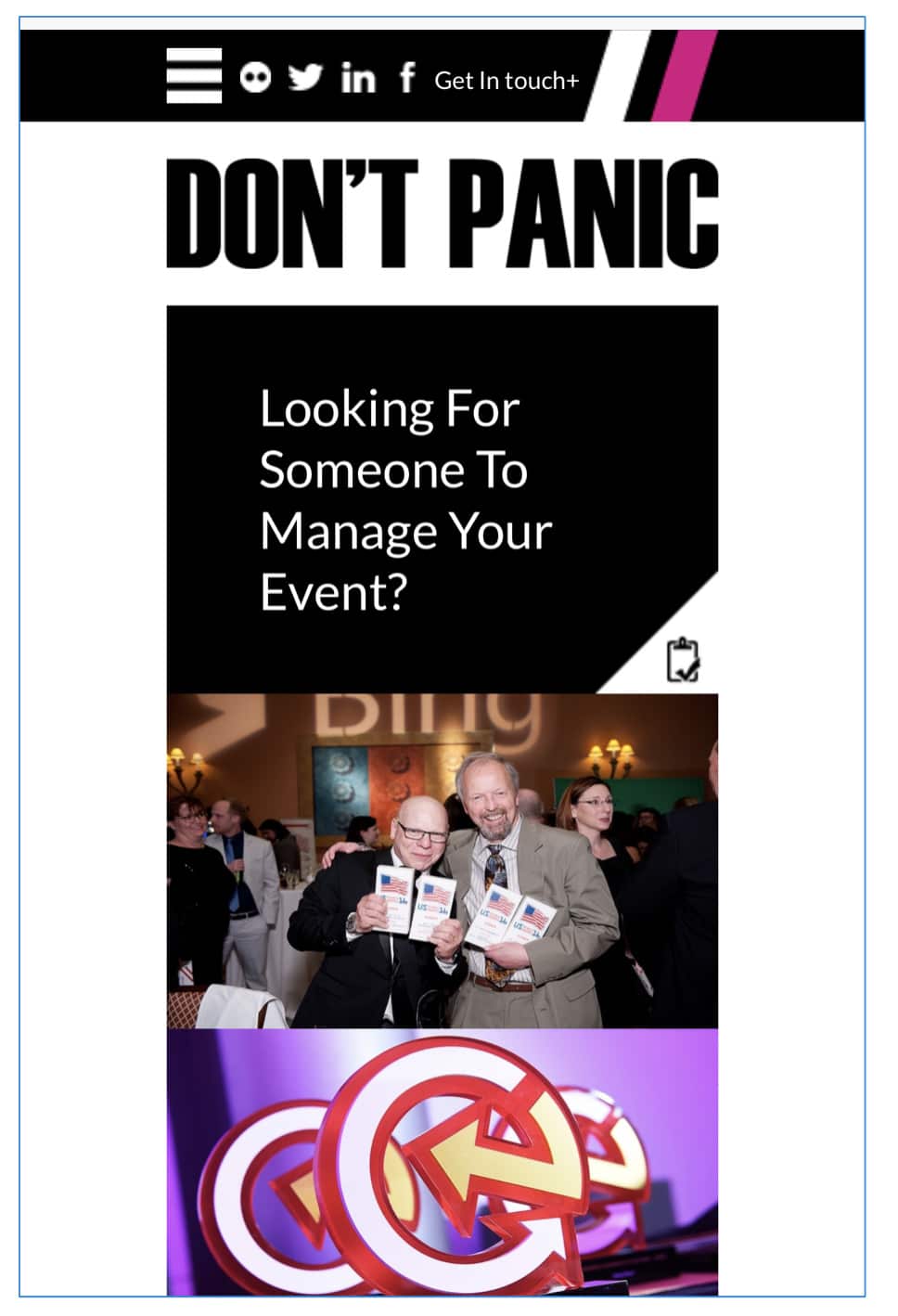
It was the home page for all the different events being sponsored by the conference, not a basket. In fact, nothing had been added to the basket at all. Unsurprisingly, he chose not to purchase tickets, and the event organizer lost revenue in the process.
These are basic usability issues. Fixing them increases both conversions and trust in the brand and company.
3. Bad or irrelevant content
They say content is king. However, a king with no subjects is a loser, and content with no audience is useless. Every day, marketing dollars are wasted sending traffic to landing pages with poor content.
Our advice? If you want your content landing pages to convert at a higher rate, make sure you’re driving traffic to content that's explicitly curated to the interests of the reader.
4. Lack of cohesive branding
A landing page can be out-of-this-world impressive in terms of click-through, engagement, and even conversions to the next step... but once visitors get beyond that landing page to “the next step,” the conversions dwindle.
The reason why this could be happening is that there is a lack of congruence between the landing page and the remainder of the site. A landing page that is a departure from the typical branding, color scheme, and messaging of a website can produce gains at the very beginning, but it will likely cause a poor user experience after initial engagement.
5. Not focusing on long-term engagement
Conversion is never a linear process. It also shouldn’t be (for most companies and campaigns) about a single transaction. When we think about conversion rate optimization, we think about it in terms of sustained engagement. What messaging can we use to persuade visitors now that will also bring them back later?
6. Too many form fields
If a user has already clicked on your ad and arrived at your landing page, your job is to persuade them to take the next action in your conversion funnel.
However, if your form has too many fields, there's a good chance you'll lose them. If you MUST have all the fields, break the process into a multiple steps with more digestible groups of fields to fill out.
7. Slow load times
The amount of time that takes for your landing page to load is very critical because it has a direct impact on its conversion rates. As mentioned previously, every one-second delay in page load time could lead to $1.6 billion in annual losses for online merchants as big as Amazon.
Not sure how to resolve load time issues? Tools like Google’s PageSpeed Insights will help you identify the elements on your page that take a long time to load. Also consider reducing the size of large images, minimize redirects whenever possible, and clean up your code.
8. Misleading headlines
The moment you land on a webpage, you want to know exactly what the page is about. Therefore, your eyes start looking for headlines to give you glimpse of what you’re about to purchase.
If your landing page headline is not related to the ad the visitors clicked on, chances are good that those visitors will leave the page immediately. If your headline is not making your visitors want to read more about your product, it should be changed. Make sure that your headline stands out in color or size, too.
You can always test your landing page headlines to avoid this mistake. This directly relates to the concept of continuity – the continuum of ideas and keywords from the ad to the actual headline and landing page is critical to avoid high bounce rates.
9. No headline at all
Again, the headline is the first copy the visitor will see. As you might already know, your page visitors have a short attention span. You have less than 5 seconds to capture their attention, so learn more about how headlines should look like in our beginner-friendly guide to designing conversion-oriented landing pages.
10. The wrong images
Did you know that using custom images can increase conversion rates as much as 35%?
When it comes to images, you can go wrong in many ways:
• Using generic Shutterstock images
• Using images that are too small
• Using distracting images
• Using too many images
Choosing the right images may takes some time and investment, but in the end, it’s worth the effort.
11. Targeting the wrong audience
Sometimes a particular source of traffic can target a specific market segment.
Such was the case of a client that received the majority of the site traffic and conversions through the use of influencer traffic. The demographic of that traffic soon became clear: 18–24-year-old males. However, the client had developed the product to serve 35-50-year-old males. That’s who they thought they were targeting, but the influencers they had chosen were serving a different tribe.
When choosing a source of traffic, figure out who those visitors are and create products and messaging that will appeal to them specifically.
12. No clear goal for the page
Often, landing pages try to do too much all at once. This only causes visitors to become more confused about how to proceed. Depending on the campaign you’re running and where the visitor is coming from, you need to figure out exactly what you want them to do, then make that abundantly clear on the page.

This does not negate having secondary goals. They should never, however, share the prominence of a primary goal. By glancing at the page, anyone should clearly be able to know what to do next.
13. Not distinguishing yourself from the pack
A landing page is your best opportunity to define what makes your service or product better than the rest. However, identifying what makes your company unique is a significant challenge. With so many competitors, how do you stand out? The reality is that products and even services have become so commoditized that it’s difficult for customers to distinguish the differences.
Identify the key differentiators between you and your competitors. For instance, when Zappos first rolled out free next-day shipping and easy next-day returns, it helped distinguish them from the rest of their industry. It wasn’t about the product, but rather the experience visitors had with the ease of getting different shoes, trying them, and returning them easily.
14. Too many inputs in a dropdown
Our CEO was recently trying to subscribe to a website's email list. The site asked him to select his time zone using a dropdown.
Then, the dropdown opened.
It offered a tremendous number of inputs for selecting a time zone. Imagine a visitor, who’s in hurry and looking for one time zone, being faced with all of these choices. When he ended up scrolling through literally every time zone possible – in fact, multiple cities in a single time zone – he ended up bouncing from the page.
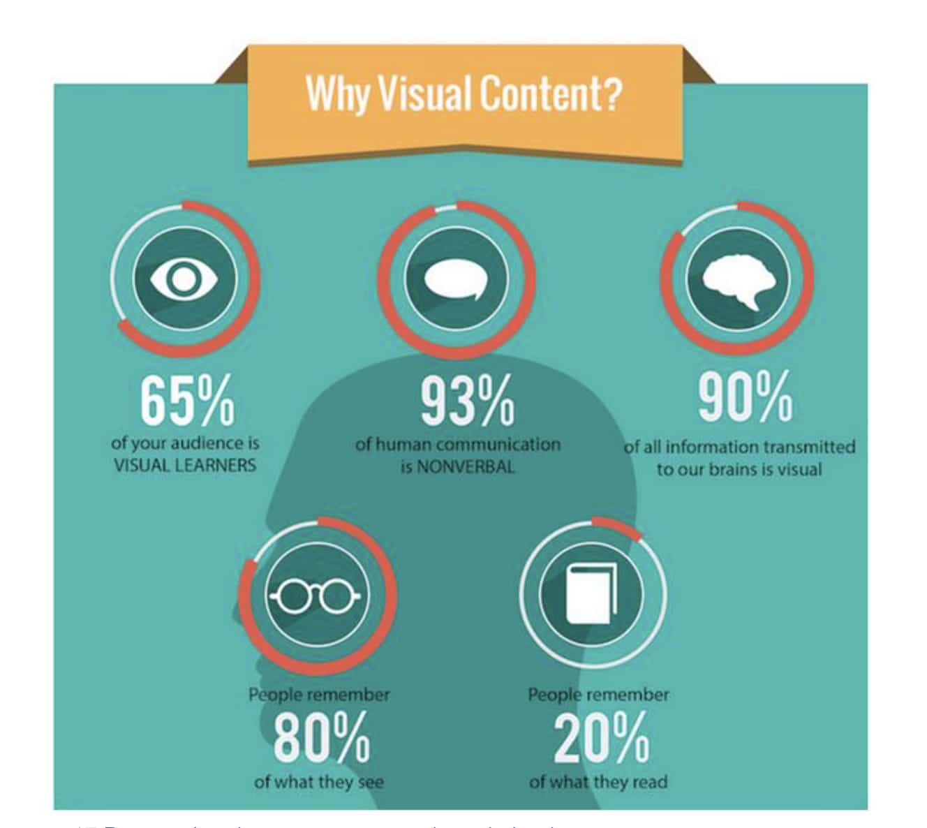
15. Absence of visuals
According to a study by Zabisco, our brain processes 90% of information in visual format. For that matter, the human brain processes images 60,000 times faster than text. If your landing page hasn’t been able to convey its value proposition effectively, then you need to incorporate visuals that will help get the message across.
16. Not A/B testing
If you're reading this blog post, you already know that A/B testing is a must when it comes to converting more visitors into customers. In fact, 60% of companies believe that A/B testing is “highly valuable” for conversion rate optimization.
You are killing your conversion rate with bare hands if you don’t A/B test your landing pages. Test whenever possible to improve your results over time.
17. Renders badly on mobile
If your landing page is not optimized for mobile, you’re losing money and credibility.
For many of our clients, mobile is a significant source of traffic, but the conversion rates from mobile visits leave much to be desired. For instance, a recent client gets the same amount of traffic from similar sources to mobile and desktop. The desktop conversion rate is 7%, whereas mobile isn’t even at 1%. Why is that?
Right off the bat, we could tell the mobile experience was poor because of its responsiveness. While responsiveness is necessary, it’s also critical to go back and see what aspects of the responsiveness are killing the user experience and simplicity of the landing page.
For instance, a banner created for desktop can’t be taken with same copy and design and slapped on mobile. The text size, button size, and amount of copy will need to be adjusted accordingly for the mobile experience.
18. Outdated design
While most companies have this taken care of, there are still outliers who don't realize their design needs some work. No visitor wants to land on your page to see a design that looks like it hasn’t been changed since 2006. If you’re already spending money on ads, then I suggest you spend a little bit more to work on your website design as well.
19. Unclear call to action
Your CTA is the heart of your landing page.
We see many common mistakes with calls to action. First, you might have too many of them. Or, you've placed the CTA in the last part of the page, or even used the same color for the CTA as the website background. Visitors should not have to spend time looking time looking for your CTA.
So, how can you make sure your CTA is clear and clickable?
Less is more. Try placing one CTA per landing page.
Keep it visible. Place the CTA in an accessible location to the visitor.
Make it distinct. Try to use a color that contrasts with the design of your page.
For more help, review this complete guide on call to action buttons, design, and copy.
20. Too much body copy
Don’t overload your landing page with lots of text. It confuses visitors and makes your design too cluttered and complicated, causing high bounce rates.
To avoid this issue, here are few tips:
• Use small paragraphs. Keep it short and to the point.
• Create visual hierarchy with bullet points, headlines, and sub-headlines.
• Only highlight the most important points you think visitors shouldn’t miss.
When you have a lot to say, consider using video rather than text. Instead of writing out a 15-step process, perhaps use a 30-second tutorial video.
21. No social proof
Many companies forget the power of social proof. Having honest reviews from real customers who use your product or services will build trust and can inform the visitors about your product or services in a better way than you’ve described it. When adding testimonials, use the full name of the customer with a real picture of the person to emphasize the human element.
22. Not enough information about your company
“Who are you? What are you doing? How long have you been in the industry? Why should I trust you?” These are all questions your website visitors likely have when they land on your page.
Try to include a link to a simple "About Us" page in the top nav or footer of your website to help educate visitors about your company.
23. No trust icons
Immediately gaining credibility is important. Don’t give visitors an opportunity to question your business. Give them the evidence quickly through the seals and recognition relevant to your industry that prove you're worthy of doing business with.
24. No emotional triggers
As neurologist Antonio Damasio argues in his book Descartes Error, “Emotion is a necessary ingredient to almost all decisions.” While most people believe the choices they make result from rational analysis of available alternatives, the truth is, emotions are the main drivers in the entire decision-making process.
There are many emotional triggers you can use to boost your revenue and drive your conversion through the roof, and these are few main pointers:
• Tell a story
• Create a sense of urgency
• Employ altruism
• Encourage reciprocity
• Build trust
• Capitalize on nostalgia
25. Too technical
Regardless of your offering, you need to know your market well. Every conversion optimization project starts with creating personas. You may discover that those purchasing your product or service don’t necessarily know all the technical lingo associated with it. That means your copy should be simple enough for the average Joe to understand.
26. Visual distractions
I already suggested using images and videos to persuade the visitors to read more.
Choosing the right image tends to deliver the information correctly. Perhaps even a 60-second video can explain your whole product and why visitors should buy it. However, overloading the page with too many visuals – like competing background videos – can easily distract the visitors instead of attracting their attention.
27. Long videos
Videos can be great, but they should never be too long. Remember, visitors are impatient. What needs to be included in the video is just the brief description of the product or service and the problem it solves. Extra fluff takes away from the impact making the video too long and difficult to follow.
28. Not tagging website visitors
Retargeting is also extremely useful, so ensure that you’re tagging visitors as they come to your landing page so you can retarget them with great content and offers later and bring them back to your site.
29. Talking about features and not benefits
You might think your product or service is the best in the world or has the most mind-blowing features. We can’t argue with that, but it isn't what visitors care about. Instead, they want to know what's in it for them.
For example, a typical delivery service might use these value propositions on their landing page:
• The best delivery service in the world
• Many trusted customers are using our product
However, this is what visitors actually want to see:
• Get your order delivered within 30 minutes
• Track your order easily online
• Get your money back if your order is not delivered within 30 minutes
• 15% discount on your next delivery when you refer us to a friend
30. People can't figure out what you sell
Internet visitors are seeking information that they can easily consume. If your landing page is not able to convey its point in 5 seconds, you’ve lost a possible customer.
Wrapping it up
Remember, you can’t just throw together some words and visuals and call it a landing page.
Instead, spend some time and money on the page design, copywriting, and continually testing your choices. There are more tips and tricks to getting that perfect landing page, but if you avoid these 30 mistakes, you'll be well on your way to greater conversion rates and visitor satisfaction.
Did we miss anything? Leave us a comment below!
MOST RECENT ARTICLES


Want to engage your audience and grow your brand? Try Emma's robust easy-to-use product today.